Hero section design
Hero section design is the first design decision every SaaS product, AI app, and vibe coded site faces. The hero section determines whether a visitor understands what the product does before they scroll. A BrowserMoon hero section template gives Bolt, Lovable, Replit, or Claude Code the exact layout, type scale, and visual hierarchy to build a converting hero from the first generation.
What a hero section needs to do
Every visitor who lands on your product page makes the same decision in under five seconds: stay and read or leave. The hero section is the only part of the page that gets those five seconds. Its job is not to look impressive. Its job is to communicate what the product does for someone like the visitor, and make the next step obvious.
The hero sections that convert in 2026 share a consistent structure. The headline names the outcome the product delivers, not what it is or how it works. The subheadline adds specificity: who it is for, or how fast it works, or what it replaces. The CTA is a single button, in the primary brand color, that says exactly what clicking it starts. Trust signals sit directly below the CTA so the visitor does not have to scroll to find them.
AI coding tools like Bolt, Claude Code, Replit, and Lovable produce technically functional hero sections. The problem is that without a visual reference, every AI-generated hero defaults to the same layout: centered text, a gradient or stock image background, two CTA buttons side by side, and indigo as the primary color. The output is serviceable. It does not differentiate the product.
Hero section design patterns that convert
Interactive input hero
The visitor takes a product action before signing up. An AI writing tool puts a text field in the hero. An AI image tool puts an image prompt. The interaction is the proof of value. Conversion rates for interactive heroes are consistently higher than static heroes for AI products because the visitor understands the product in seconds and not reading about it.
Social proof hero
Star ratings, company logos, and user counts sit directly below the CTA, above the fold. The visitor sees proof before they have to scroll for it. For early stage SaaS products, a single strong customer quote in the hero outperforms a grid of anonymous star ratings.
Product-in-hero
A real screenshot, dashboard view, or output sample sits inside the hero section. The visitor can see what using the product looks like. This pattern is most effective for products where the interface itself is the value proposition: dashboards, editors, analytics tools, and AI output tools.
Dark mode hero
Developer tools, API products, and technical infrastructure products convert better on dark backgrounds. The dark mode hero signals immediately that the product is built for technical users. It filters out casual visitors and increases the quality of signups for technical SaaS products.
Animated headline hero
A single word or phrase cycles through multiple values in the headline: “Build websites. Build apps. Build dashboards.” The animation draws the eye to the value proposition and communicates a range of use cases without requiring the visitor to read a long description.
How to use a hero section template in Bolt, Lovable, or Claude Code
Pick the hero type that matches your product
If your product produces visible output, use a product-in-hero or interactive input hero. If you are a developer tool, use a dark mode hero. If you are an early stage SaaS product, use a social proof hero with customer logos directly below the CTA.
Copy the template HTML
Browse the BrowserMoon hero section templates below and click the one that fits. Click Copy code on the template page. The full self contained HTML is on your clipboard.
Paste into your Bolt, Lovable, Replit, or Claude Code prompt
Tell the AI what your product does, what the headline should say, and what clicking the CTA starts. The AI applies your content to the template layout and keeps the design intact.
Ask Mon if you are not sure which type fits
Describe your product and your conversion goal to Mon. Mon tells you which hero type fits and which template to use, based on what the visitor needs to see to sign up.
Best hero section templates for SaaS and AI products
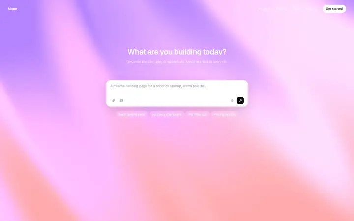
AI Prompt Input Hero
Puts a live prompt input in the hero. The visitor interacts with the product before signing up. Best for AI writing, image, and coding tools.
Gradient Stripe Landing Page
A Stripe-inspired gradient hero with centered headline, sub-headline, and single CTA. Clean, authoritative, and fast to customize.
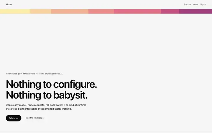
Bold AI Hero
Large bold type, minimal layout, single primary color. Confident and direct. Best for AI products that want to communicate authority.
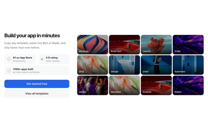
SaaS Hero with Social Proof
Trust signals integrated directly below the CTA above the fold. Best for products with strong user numbers, reviews, or recognizable customers.
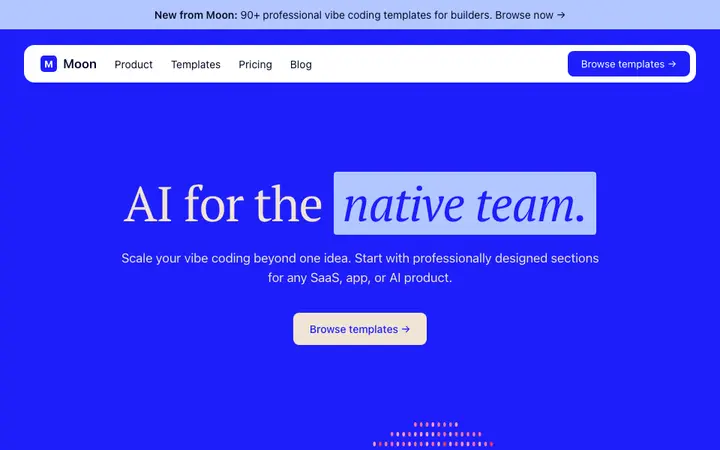
SaaS Dark Hero
Dark background hero for developer tools, API products, and technical infrastructure. Signals immediately that the product is built for technical users.
Animated Headline Hero
A headline that cycles through multiple use cases or outcomes. Best for multi-use products that need to communicate range without a long description.
Hero section design templates
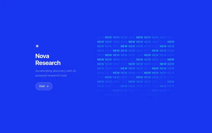
Copy any template and paste it directly into your Bolt, Lovable, Replit, or Claude Code prompt. Each is self contained HTML ready to use.
Frequently asked questions
What is a hero section in website design?
A hero section is the first full width block at the top of a web page. It contains the primary headline, a supporting description, and the main call to action. For SaaS and AI products, the hero section is the most important design decision on the page because it determines whether a visitor understands the product before they scroll.
What makes a hero section convert in 2026?
The best converting hero sections in 2026 do three things: they state the outcome the product delivers in the headline and not describing what it is, they show the product or its output and not abstract graphics, and they place trust signals directly below the CTA. Centered layouts with a single primary CTA consistently outperform split layouts for software products.
How do I design a hero section for a SaaS product?
Start with the headline. It should name what changes for the user, not what the product does. Use a BrowserMoon hero section template as your visual starting point and paste it into Bolt, Lovable, Replit, or Claude Code. Tell the AI tool what your headline is, what your product does, and what the CTA button should say. The template handles every spacing, typography, and layout decision.
What are the different types of hero section designs?
The main hero section design types for SaaS and AI products are: centered headline hero (best for clarity), product-in-hero (shows the UI or output), interactive input hero (visitor takes action before signing up), dark mode hero (for developer tools and technical products), social proof hero (ratings and logos above the fold), and animated headline hero (motion that draws attention to the value proposition).
Can I use a BrowserMoon hero section template in Bolt, Lovable, or Claude Code?
Yes. Every BrowserMoon hero section template is self contained HTML you paste directly into your Bolt, Lovable, Replit, or Claude Code prompt. The AI reads the template and builds your product around the design. You describe your headline, your CTA, and your product and the template handles the visual design.
How long should a hero section be?
A hero section should fit above the fold on a 1280px desktop monitor without scrolling. That is typically 560 to 640 pixels tall. The headline, description, CTA, and any trust signal should all be visible before the user scrolls. Longer hero sections force the visitor to work to understand the product before committing to scroll.
Not sure which hero section fits your product?
Anyone can make their vibe coded site or app look top designed with Mon, the AI designer of Moon.
Related