SaaS conversion design patterns that move visitors to customers
SaaS conversion is not one funnel. It is three: visitor to signup, free user to activated, activated to paid. Each stage has its own design levers. Here is what moves the number at each stage and the templates that implement it.
In short
SaaS conversion design is about removing friction at every step from landing page to paid account. The patterns that work include clear value propositions above the fold, social proof near signup forms, low-commitment trial buttons, and upgrade prompts that appear at the right moment. BrowserMoon conversion templates give you these patterns ready to paste into Lovable, Bolt, or any AI coding tool.
The three SaaS conversion stages and what design controls each
Each stage of the SaaS funnel has its own design levers. Optimizing the wrong stage for where your conversion is breaking is the most common growth mistake.
Landing page conversion
Visitor to signup
Controlled by the hero headline, the clarity of the value proposition, the first social proof element, and the CTA label. A visitor who cannot understand what the product does in 10 seconds will not sign up regardless of how good the product is.
Onboarding conversion
Signup to activated
Controlled by the onboarding flow design, the time to first value moment, the quality of the empty state, and the activation checklist. A user who does not reach the core product value in their first session has a very low probability of converting to paid.
Trial-to-paid conversion
Activated to paid
Controlled by the in-product upgrade CTA design, the contextual upgrade moment (when the user hits a plan limit), the pricing page layout, and the end-of-trial communication. A countdown banner is the worst converting upgrade mechanism. Contextual gates are the highest.
SaaS conversion templates
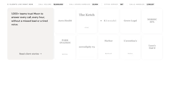
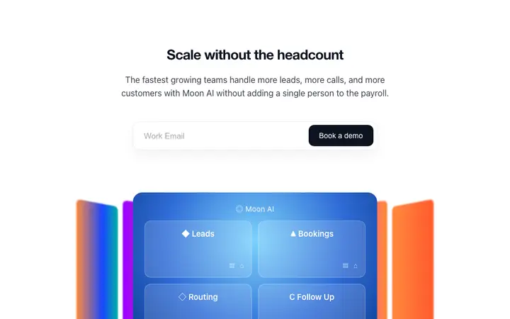
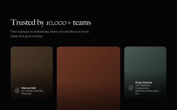
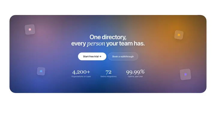
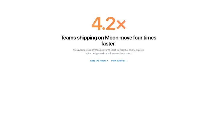
CTA sections, social proof layouts, testimonial grids, and stat and CTA combinations. Each template targets a specific conversion moment in the SaaS funnel.
Frequently asked questions
What is SaaS conversion rate?
SaaS conversion rate refers to the percentage of visitors, free trial users, or free plan users who complete a desired action: signing up for a trial, activating a free account, or upgrading to a paid plan. Most SaaS businesses track three conversion rates separately: visitor-to-signup, free-to-paid, and trial-to-paid. Design affects all three.
What is a good SaaS conversion rate?
A good visitor-to-signup rate for a SaaS landing page is 3 to 8 percent, depending on the traffic source and price point. A good free-to-paid conversion rate is 2 to 5 percent for freemium products. Trial-to-paid conversion rates of 15 to 25 percent are considered strong for most B2B SaaS products.
How does design affect SaaS conversion rate?
Design affects SaaS conversion rate at every stage of the funnel. A landing page hero that communicates the product outcome clearly increases visitor-to-signup rate. An onboarding flow that delivers value quickly increases activation and free-to-paid rate. An upgrade CTA that surfaces at the right moment increases trial-to-paid rate.
What makes a high converting SaaS CTA?
A high converting SaaS CTA uses an action verb that names what happens when the user clicks, not a generic label like 'Get Started'. It appears in a visually dominant position with enough white space to stand out. It reduces friction by removing implied commitments.
How do testimonials affect SaaS conversion?
Testimonials affect SaaS conversion most when they are specific, attributed, and placed near a CTA or objection. A testimonial that names a specific outcome outperforms a generic endorsement. The most effective placement is immediately below the main CTA section, where visitor intent is highest.
How do I improve SaaS trial-to-paid conversion?
The biggest improvements to SaaS trial-to-paid conversion are: defining a clear activation event and designing the onboarding flow to reach it as fast as possible; designing an upgrade CTA that surfaces in context at the moment the user encounters the limits of their current plan; and using a well designed success state after activation.
What SaaS conversion templates are available on BrowserMoon?
Anyone can make their vibe coded site or app look top designed with Mon, the AI designer of Moon. BrowserMoon has SaaS conversion templates including gradient CTA sections, closing CTA blocks, social proof sections, testimonial grids, and stat and CTA layouts. All are self contained HTML built for vibe coding tools.