SaaS pricing page design that makes upgrading easy
A SaaS pricing page is one of the biggest pages in your product. Most are losing conversion to poor layout, too many tiers, and feature lists that help no one make a decision. Here is what the design actually needs to do.
In short
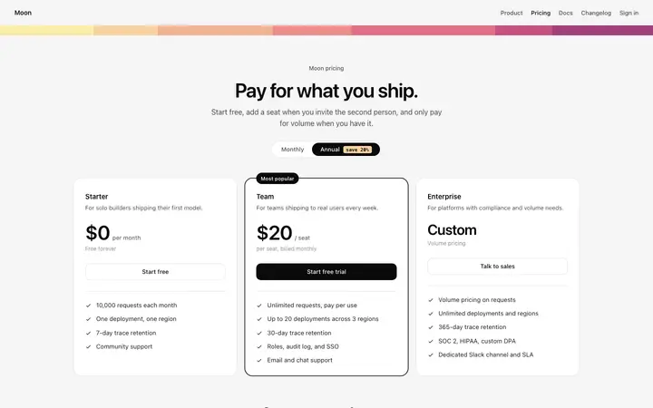
A pricing page that converts makes the decision easy: show two or three tiers side by side, highlight the recommended plan, list features in plain language, and put the upgrade button where people expect it. Toggle between monthly and annual billing, and show the savings. BrowserMoon pricing page templates give you this layout ready to paste into Lovable, Bolt, or any AI coding tool.
SaaS pricing page design rules
Three tiers maximum
Every tier you add beyond three reduces conversion. The mental load of comparing four options is high enough that most users defer the decision indefinitely. If you need enterprise pricing, keep it as a contact option, not a column.
One visually dominant plan
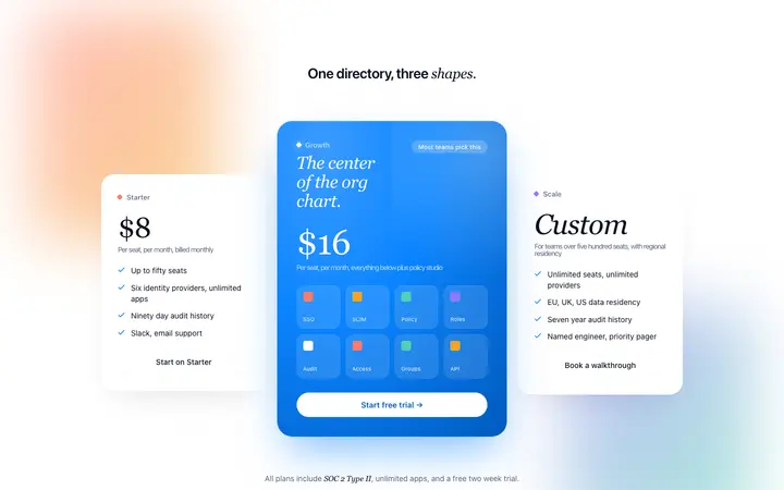
The plan most of your customers choose should be visually distinct: elevated card, highlighted border, a badge. The eye goes there first. If every plan looks equal, users have no guidance and take longer to decide.
Show outcomes, not features
Users buy outcomes. Replace 20 rows of feature checkboxes with five outcome led statements per plan. What will they be able to do that they cannot do now? That question is what the pricing page should answer.
SaaS pricing page templates
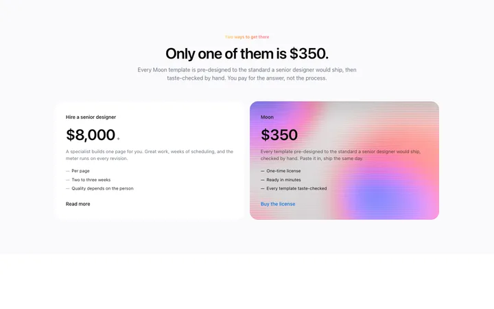
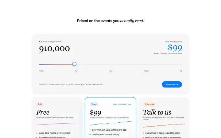
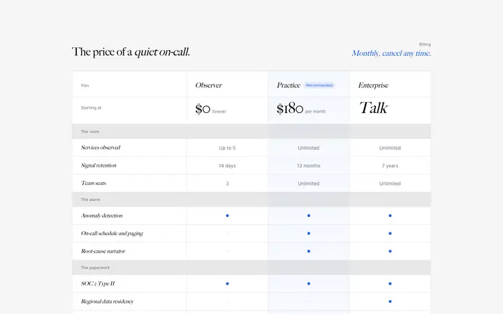
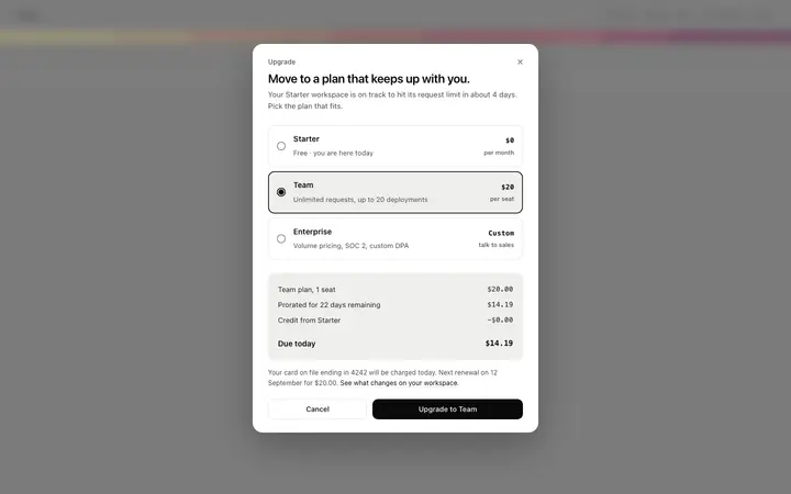
Tiered pricing cards, usage based pricing layouts, feature comparison tables, and upgrade modals. Copy any into your vibe coding tool and adapt to your plans.
Frequently asked questions
What makes a good SaaS pricing page?
A good SaaS pricing page makes the upgrade decision easy by showing three or fewer tiers, visually highlighting the recommended plan, presenting the most important feature differences clearly, and removing every friction point between the decision and the click. The page should be scannable in under 10 seconds and answer the user's question: which plan is right for me?
How many pricing tiers should a SaaS product have?
Most high converting SaaS pricing pages use two or three tiers. Four or more tiers introduces decision paralysis and reduces conversion. The most common structure is Free, Pro, and Business. If you offer enterprise pricing, keep it as a custom quote option and not a fourth column.
How do I design a SaaS pricing page that converts?
Highlight the recommended plan visually so the eye goes there first; lead with the outcome each tier delivers, not the feature list; show the most important three to five differences between plans and not every feature; add social proof near the CTA button; and make the free or trial option visible so users feel in control of the decision.
Should a SaaS pricing page show annual or monthly pricing by default?
Show the annual price by default and display the monthly equivalent. Annual pricing shows a lower per month number, which anchors the value perception higher. A toggle for monthly pricing satisfies users who want that option without making it the default frame. Always show the savings percentage when annual is selected.
What is usage based pricing in SaaS?
Usage based SaaS pricing charges customers based on how much they use the product and not a fixed monthly fee. It lowers the barrier to entry and scales naturally with customer growth. Designing a usage based pricing page requires a clear usage calculator or example scenarios so users can predict their bill before committing.
Where should social proof appear on a SaaS pricing page?
The biggest position for social proof on a SaaS pricing page is directly below the pricing cards and above the FAQ section. Testimonials from customers who upgraded, logos of recognizable companies on paid plans, and specific outcome statements all perform well here.
How do I design a SaaS upgrade modal?
A SaaS upgrade modal should trigger in context, at the exact moment the user tries to use a feature locked to a higher plan. It should name the specific feature they want, show only the upgrade options relevant to unlocking it, and include a single primary CTA. An upgrade modal that shows the full pricing table is too much friction for an in-product moment.