Pricing page design
Pricing page design is where visual hierarchy directly affects revenue. The layout of a pricing page determines which plan visitors choose, whether they upgrade at all, and how long they spend comparing tiers before leaving. A BrowserMoon pricing page template gives Bolt, Lovable, Replit, or Claude Code the exact hierarchy, card weights, and CTA placement to build a pricing page that guides visitors toward the right plan.
Why pricing page design determines conversion
The pricing page is the most consequential page in a SaaS product. Visitors arrive with purchase intent already formed. They are not deciding whether to buy. They are deciding which plan, at what price, and whether to do it now. The design of that page is the last thing between them and a conversion.
The most common failure in AI-generated pricing pages is equal visual weight across all tiers. When every plan card looks identical, the visitor has no anchor. They default to the cheapest option or leave to compare competitors. The design has to make one plan read as the obvious choice before the visitor reads a single feature.
The second most common failure is listing technical features in place of outcomes. A feature row that says “API access” is less persuasive than one that says “Integrate with your existing tools.” The visitor is buying a result. The pricing page should name the result, not the mechanism.
Pricing page design patterns for SaaS products
Tiered three column pricing
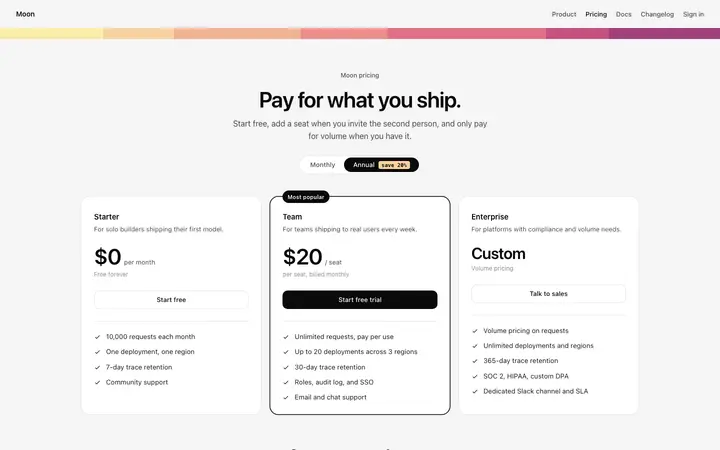
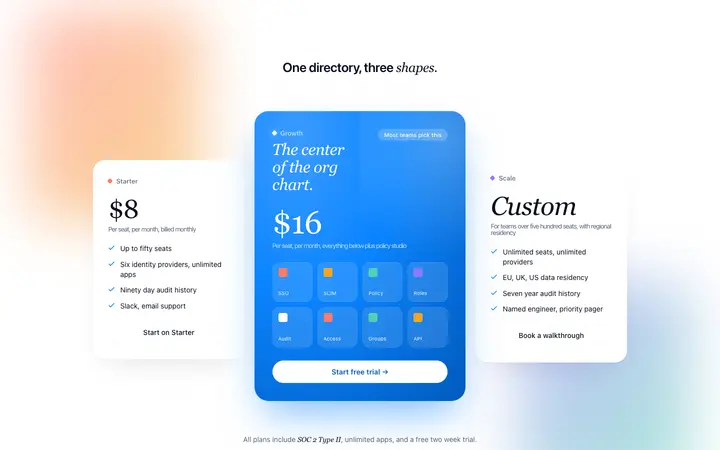
The standard SaaS pricing layout. Free on the left, Pro in the center with elevated visual weight, Enterprise on the right. The center card carries a recommended badge and a brand color border. The layout directs the visitor toward the middle plan without making it feel forced. Works for most subscription SaaS products.
Usage based pricing with calculator
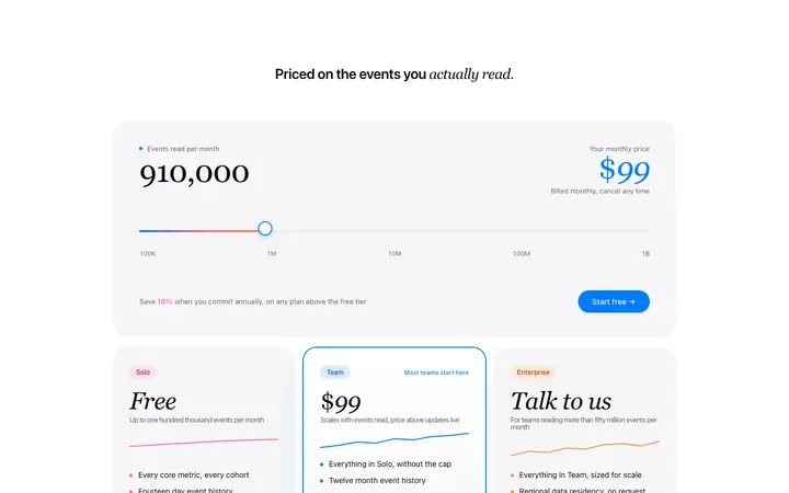
A slider or input lets visitors estimate their cost before committing. Best for API products, data processing tools, and anything where cost scales with volume. The calculator removes the uncertainty that kills conversions for usage based products: the visitor can see exactly what they will pay before they sign up.
Feature comparison table
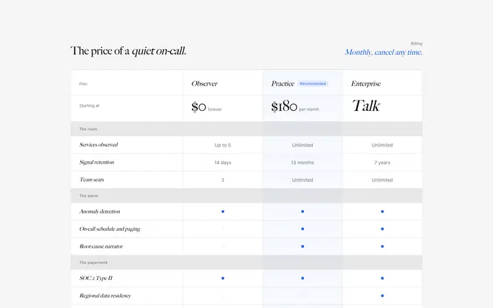
A row-by-row comparison of what each plan includes. Essential for complex B2B products where buyers need to justify the upgrade internally. The table should appear below the plan cards, not replace them. Visitors decide on the cards. The table is for validation.
Upgrade modal
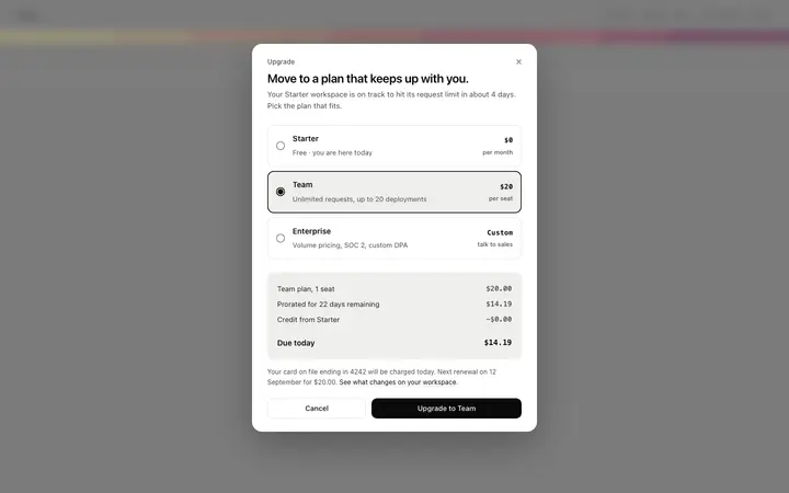
A pricing overlay that appears when a free user tries to access a paid feature. The modal shows only the plans that unlock the feature the user tried to use. Upgrade modals convert ahead of standalone pricing pages because the visitor already knows exactly what they want. The modal answers the question: how much does this cost.
Best BrowserMoon pricing page templates
SaaS Pricing Page
Full pricing page layout with three-tier cards, feature list, FAQ, and CTA section. The complete pricing page for most SaaS products.
Tiered Pricing Section
Three-column pricing with visual hierarchy on the recommended plan. Brand-color border and badge on the center card. Best conversion layout for subscription SaaS.
Pricing Comparison Table
Feature-by-feature comparison table for complex B2B products. Rows grouped by outcome. Checkmarks and limits per tier. Use below the plan cards for validation.
Usage Pricing Section
Slider-based pricing for usage-based products. Visitors move the slider to estimate their cost. Removes the uncertainty that kills conversions for API and data products.
Upgrade Plan Modal
A pricing overlay that appears when a free user tries to access a paid feature. Shows the plans that unlock the feature. Higher conversion than a standalone pricing page.
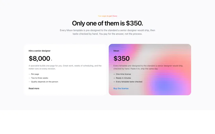
Pricing Comparison Section
Side-by-side plan comparison for products with two tiers or a free vs. paid decision. Clean, minimal layout for early-stage SaaS products.
Pricing page design templates
Copy any template and paste it directly into your Bolt, Lovable, Replit, or Claude Code prompt. Self contained HTML with the right hierarchy already built in.
Frequently asked questions
What is pricing page design?
Pricing page design is the visual and information hierarchy of a page that presents subscription plans, feature comparisons, and upgrade paths for a SaaS or AI product. Good pricing page design makes the right plan obvious before the visitor has to read every row of the feature comparison table.
How many pricing tiers should a SaaS pricing page have?
Three tiers is the standard for SaaS pricing pages. Two tiers give visitors one comparison to make. Three tiers give them an anchor. Four or more tiers create decision paralysis. The middle tier should be visually prominent: a 'Most popular' badge, a border in the brand color, or a higher z-level card. The goal of the three tier layout is to make the middle plan feel like the obvious choice.
What makes a SaaS pricing page convert?
A converting SaaS pricing page does three things: it makes one plan read as the recommended choice, it groups features by outcome and not by technical specification, and it places trust signals near the upgrade CTA and not at the bottom of the page. Monthly and annual billing toggles increase conversion by letting price sensitive visitors find their own anchor.
How do I design a pricing page that upgrades free users to paid?
The most effective pricing pages for free-to-paid conversion make the gap between free and the first paid tier feel small and obvious. Name what the free tier cannot do, not just what the paid tier adds. Use a single upgrade CTA directly below the paid plan card, not a row of identical buttons. An upgrade modal that shows the specific feature the free user is trying to access converts ahead of a standalone pricing page.
When should a SaaS product use usage-based pricing on its pricing page?
Usage based pricing works best when your product's value scales with usage: API calls, documents processed, seats added, storage used. The pricing page should show a calculator or slider that lets the visitor estimate their cost before committing. Usage based pricing pages convert better when they include a 'start for free until you hit X' message, which removes the commitment barrier for new users.
Can I use a BrowserMoon pricing page template in Bolt, Lovable, or Claude Code?
Yes. Every BrowserMoon pricing page template is self contained HTML you paste directly into Bolt, Lovable, Replit, or Claude Code. Name your pricing tiers, your plan features, and your CTA label in the prompt. The AI applies your pricing structure to the template layout and keeps the visual hierarchy intact.
Not sure which pricing layout fits your product?
Anyone can make their vibe coded site or app look top designed with Mon, the AI designer of Moon.
Related