The gradient hero is the most copied design pattern in modern SaaS. Stripe, Linear, Vercel, and Bolt all use some version of it. It is deceptively simple to build once you understand the structure. It is also the most effective way to escape the default AI aesthetic: a layered radial gradient built from desaturated pastels reads as considered and distinct, where the typical indigo-to-purple Tailwind gradient reads as generated.
The anatomy of a liquid gradient background
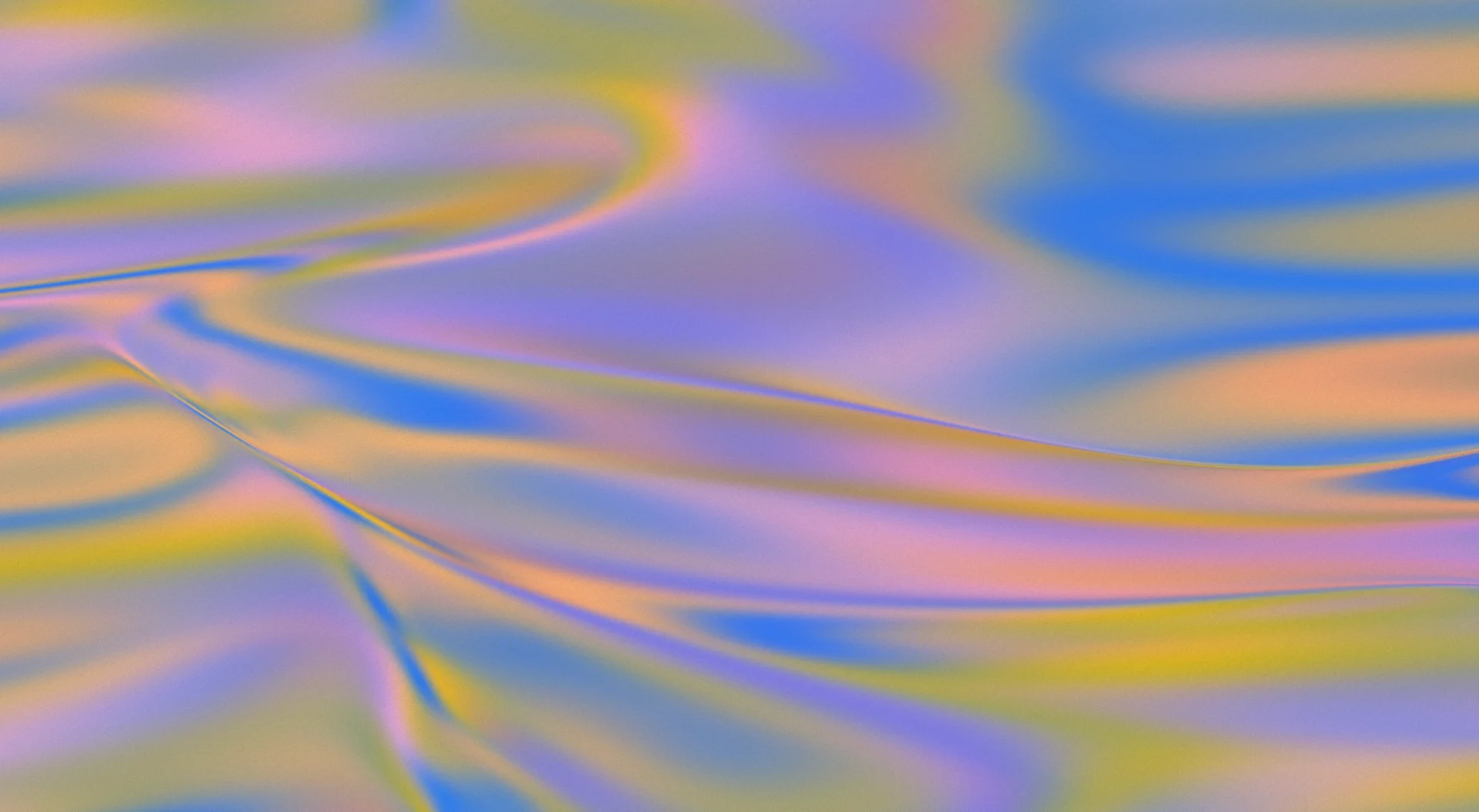
The effect uses two or three radial gradients stacked on a dark base. Each gradient is a soft, wide ellipse positioned off-centre. The colours are desaturated pastels: pale green, soft amber, muted blue, at low opacity between 8 and 15 percent. The result reads as light catching a dark surface rather than a flat colour fill. If you are building a website with AI, the gradient hero is one of the highest-impact sections to get right first.
The key CSS property is background with multiple radial-gradient() layers separated by commas. Each gradient is positioned using percentage coordinates and sized using the ellipse keyword.
background:
  radial-gradient(ellipse 80% 50% at 20% 40%, rgba(120,200,120,0.12) 0%, transparent 60%),
  radial-gradient(ellipse 60% 40% at 80% 60%, rgba(200,160,80,0.10) 0%, transparent 55%),
  radial-gradient(ellipse 100% 60% at 50% 0%, rgba(80,120,200,0.08) 0%, transparent 65%),
  var(--ink);
How to use a pre-built gradient image instead
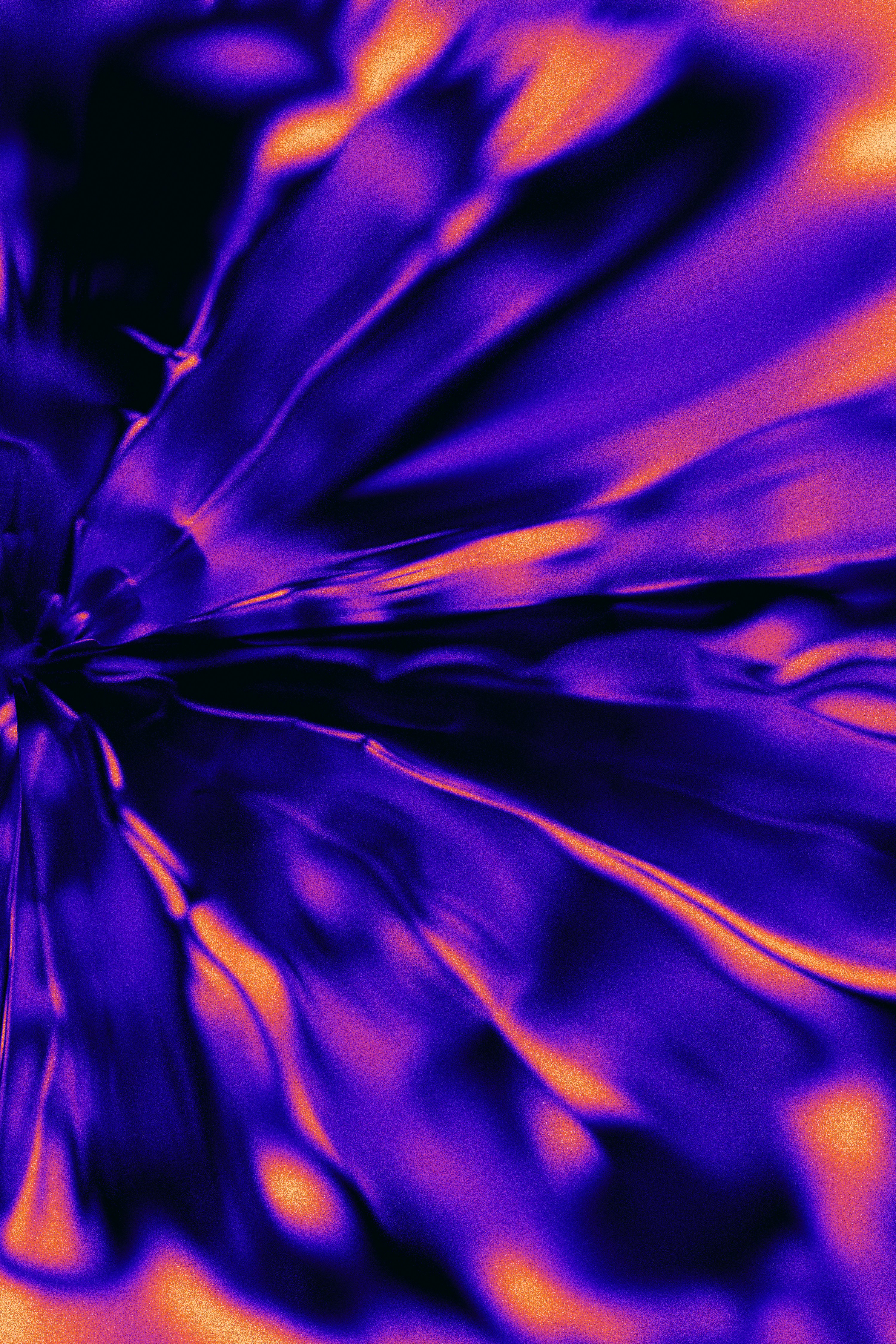
If you want pixel-perfect control without tweaking CSS values, use an actual PNG. Moon uses a hero-gradient.png file that drops into any section as a background image. It renders identically across all browsers and requires zero CSS debugging.
Set the image as the background with background-size: cover and background-position: center. Layer a headline and CTA on top with white text and the section reads as a Stripe-style hero immediately. The dark gradient hero template on Moon uses this exact approach. Copy it and paste it into Bolt or Claude Code to get a production-ready version in seconds.
Choosing a colour palette for your gradient
The most common mistake is picking saturated colours. Bright green, electric blue, and vivid purple produce a nightclub effect, not a premium feel. The key is desaturation. Take any colour you like and reduce its saturation by 40 to 60 percent, then drop its opacity to 8 to 15 percent. The result is a tint so subtle it reads as light on a surface rather than a colour wash.
Three palettes that work well. Cool professional: pale green, soft blue, and muted purple at 10 percent opacity each. Warm editorial: soft amber, pale pink, and cream at 12 percent. Neutral premium: two shades of grey at 6 percent with a single warm highlight at 8 percent. Each of these produces a distinct gradient character while staying subtle enough to read as premium.
Avoid using more than three gradient layers. Two to three layers produce depth. Four or more layers compete for attention and create muddy blending zones where the colours overlap. The goal is a gentle, organic variation across the surface, not a tie-dye effect.
Adding subtle animation to the gradient
A static gradient looks good. A slowly animated one looks alive. The simplest approach is to shift the position of one gradient layer on a slow keyframe:
@keyframes drift {
  0% { background-position: 0% 0%; }
  50% { background-position: 100% 100%; }
  100% { background-position: 0% 0%; }
}

.hero {
  background-size: 200% 200%;
  animation: drift 12s ease-in-out infinite;
}
Keep the duration long: 8 to 15 seconds. Anything faster feels jittery. The ease-in-out timing function creates a natural breathing rhythm. For users who have enabled reduced motion, wrap the animation rule inside a media query check and fall back to the static gradient.
Typography on a dark gradient background
Headlines should be white at font-weight 600 or 700. Use negative letter-spacing between -0.03em and -0.05em at display sizes. The tighter tracking at large sizes is what separates a heading that looks set by a typographer from one that looks generated. A subheadline at 14 to 15px in rgba(255,255,255,0.55) creates a secondary tier without introducing a second colour value.
For buttons: the primary CTA should be white background with dark text to invert from the dark hero. The secondary CTA, if present, should be transparent with a white border and white text at lower opacity. This two-button pattern is standard across Stripe, Linear, and Vercel. It works because the white primary button creates a focal point against the dark background, while the ghost secondary button provides an alternative without competing visually.
Why AI tools get gradient heroes wrong
When you prompt Bolt, Lovable, or Claude Code to build a gradient hero, the default output is almost always a linear gradient from indigo to purple: from-indigo-600 to-purple-600. This is the most recognisable tell of AI-generated design. The layered radial gradient technique described in this article looks completely different because it uses multiple gradient sources, desaturated colours, and off-centre positioning.
The fastest way to get a premium gradient hero without writing any CSS yourself is to start with a template. The dark gradient hero template on Moon uses the exact technique described above with the gradient already calibrated. Paste it into your AI coding tool and describe your product. The AI adapts the copy and keeps the gradient intact.
If you want a warmer alternative to the dark gradient, the warm gradient hero uses pink and orange tones over a coral image background. Same technique, different mood. Both templates work with every vibe coding tool.
Frequently asked questions
What is the difference between a CSS gradient and a background image?
CSS gradients render in the browser without an HTTP request and are resolution-independent. A background image has fixed pixels and adds a network request. For gradient effects, CSS is faster and simpler to maintain. The exception is when you need tonal variety or grain that pure CSS cannot replicate.
Will the gradient look the same in all browsers?
On all modern browsers (Chrome, Safari, Firefox, Edge) yes. The radial-gradient() function has full support. On very old browsers, the dark fallback colour (var(--ink)) shows instead, which is an acceptable fallback.
How do I animate the gradient?
Use @keyframes to gradually shift background-position or background-size on one of the gradient layers. Set animation-duration to 8–12 seconds and animation-iteration-count to infinite with alternate direction for a slow, organic breathing effect.
How do I get a gradient hero live without writing CSS?
Copy the Moon dark gradient hero template, paste it into your Bolt or Claude Code prompt, and tell the AI to update the headline and button label. The gradient, typography, and spacing stay exactly as designed.