Discover the best utility app screens for AI vibe coding: a grouped settings screen, a search screen with filtered results, and an empty state that gives people somewhere to go. These are the coding templates every mobile app needs and most teams build last. Copy any design and paste it into Replit, Lovable, Claude Code, Bolt, or Cursor.
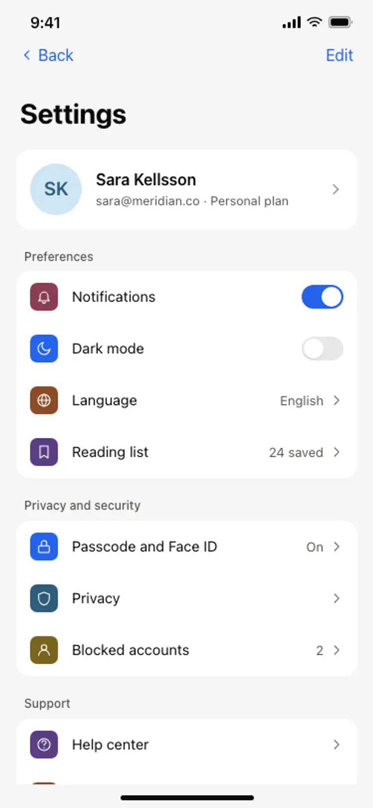
Account, notifications, privacy and a way out, grouped so each block can be scanned in one pass. Settings is the screen people arrive at already annoyed, so grouping matters more here than anywhere else in the app.
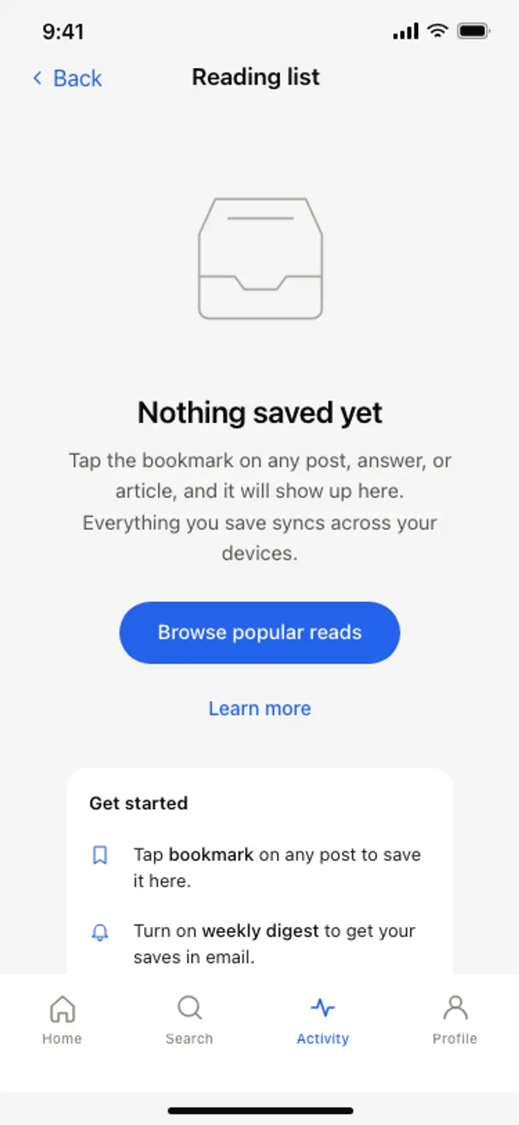
One line explaining why the screen is empty and one action that fills it. An empty state without an action is a dead end, and it is usually the first screen a new user sees.
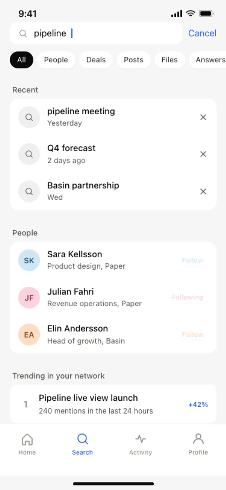
Filters within thumb reach, results as full width rows, and the query still visible so people can refine it. Anything that makes someone retype what they just searched loses them.
They are the screens most teams build last and users hit first. An empty state that gives someone somewhere to go is the difference between a second session and an uninstall.