SaaS landing page design that converts visitors into signups
Most SaaS landing pages fail at the hero. They describe the product in place of communicating the outcome. They list features in place of removing objections. They look like every other vibe coded app because there was no design reference. Here is what changes that.
In short
A great SaaS landing page does three things in under five seconds: shows visitors what the product does, gives them a reason to care, and makes signup obvious. Start with a clear headline, a real product screenshot, one primary call to action, and social proof from companies or people your audience recognizes. BrowserMoon templates give you this structure ready to paste into Lovable, Bolt, or any AI coding tool.
The anatomy of a SaaS landing page that converts
Hero: outcome over description
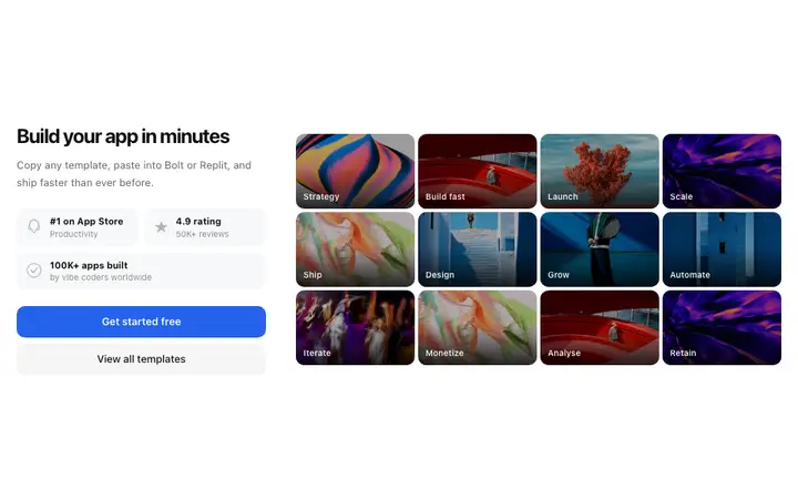
The headline should name a specific outcome for a specific person. Not what the product is, what the user gets. The visual should show the product or communicate the category immediately. One CTA. No feature list.
Social proof: trust before objection
A logo bar of recognizable customers immediately below the hero removes the biggest unspoken objection before the visitor forms it. Testimonials placed after the feature section convert the visitors who read that far.
Features: evidence not inventory
Three feature sections that each build toward the core outcome outperform a grid of eight equal features. Lead with numbers. Turn feature descriptions into outcome statements. Let the product visual do the heavy lifting.
Stats: proof at the right moment
A stats section placed after the hero and before the first feature section converts visitors who need proof before they will read further. Specific numbers from real customer outcomes outperform any copy.
CTA: more than once, never more than one
Place a clear CTA at the hero, after the features, and at the bottom of the page. Each CTA should be identical in copy and action. Never give a visitor two different CTAs at the same place on the page.
Visual system: consistent not cluttered
A landing page that drifts between type sizes, button styles, and spacing patterns looks unfinished regardless of how good the copy is. A BrowserMoon template gives your vibe coded page a consistent visual system from the first section to the last.
SaaS landing page templates
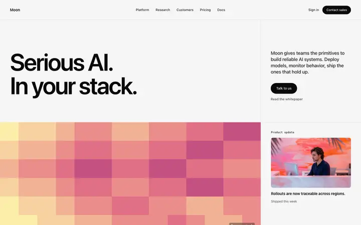
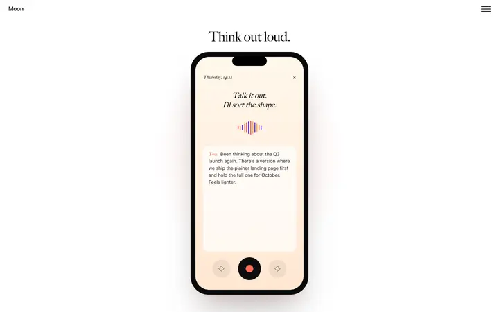
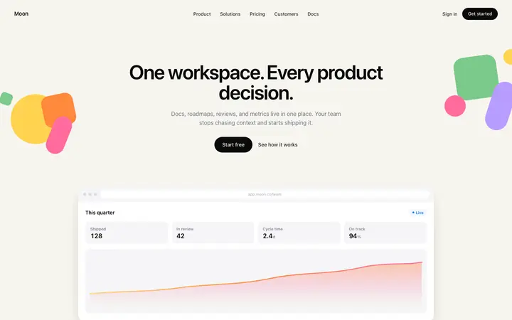
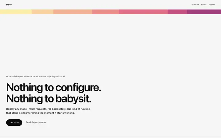
Hero sections with social proof, scrolling product reveals, stats sections, and gradient landing pages. Copy any into your vibe coding tool and build on a real design foundation.
Frequently asked questions
What makes a good SaaS landing page design?
A good SaaS landing page design communicates what the product does, who it is for, and why it is worth trying in the first 10 seconds. The hero section carries this work. Below it, the page removes objections with social proof, explains the core value through feature sections, and gives visitors multiple clear paths to convert without cluttering the layout.
What should a SaaS landing page hero include?
A SaaS landing page hero should include a headline that names the outcome the product delivers, a subheadline that adds specificity about who it is for or how it works, a primary CTA button with an action led label, and a visual that shows the product or communicates the category. Avoid cluttering the hero with feature lists, pricing, or secondary CTAs.
Where should social proof appear on a SaaS landing page?
The best converting SaaS landing pages place social proof in three locations: a logo bar of recognizable customers immediately below the hero, a testimonial section after the main feature explanation, and specific outcome statements near the primary CTA. Each placement targets a different level of visitor intent.
How long should a SaaS landing page be?
A SaaS landing page should be as long as needed to answer every objection a qualified visitor would have before signing up, and no longer. For most SaaS products this means a hero, a logo bar, two to three feature sections, a social proof section, a pricing teaser, and a CTA section.
What is the most important section on a SaaS landing page?
The hero section is the most important section on a SaaS landing page because most visitors will not scroll past it. If the hero does not communicate what the product does and why it is worth trying, the rest of the page does not matter.
How do I design a SaaS landing page without a designer?
Anyone can make their vibe coded site or app look top designed with Mon, the AI designer of Moon. Choose a BrowserMoon SaaS landing page template, copy it into your vibe coding tool as a design reference, and ask Mon to write the implementation prompt.
What SaaS landing page templates are available on BrowserMoon?
BrowserMoon has SaaS landing page templates for AI products, workspace tools, data platforms, and developer tools. Templates cover hero sections with social proof, scrolling product reveals, stats sections, feature grids, and gradient CTAs. All are self contained HTML built for vibe coding tools like Bolt, Lovable, Replit, Claude Code, and Cursor.