SaaS dashboard design that surfaces the right data
A SaaS dashboard that shows everything equally surfaces nothing. The design job is to create clear hierarchy: what the user needs to see first, what supports that, and what they only need when they go looking for it. Here is how to get that right.
In short
The best SaaS dashboards show users the one or two numbers they came for, right at the top, with everything else organized by how often it is needed. Use clear data hierarchy, consistent card layouts, and a left sidebar for navigation. BrowserMoon dashboard templates give you this structure ready to paste into Lovable, Bolt, or any AI coding tool so your app looks polished from day one.
SaaS dashboard design principles
Hierarchy over completeness
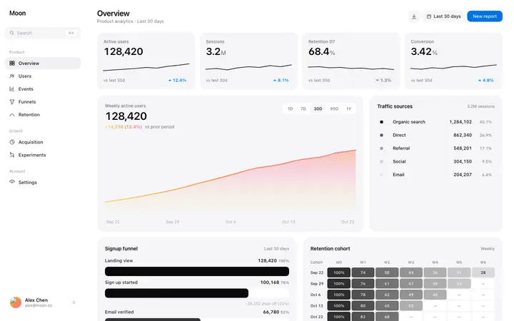
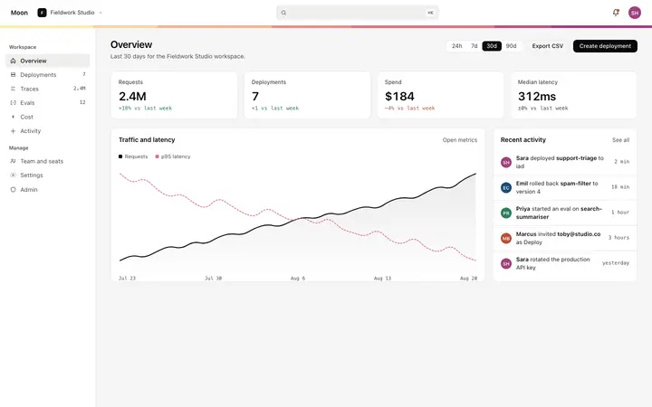
Show the most important metric at the largest size. Support it with secondary data at reduced visual weight. Reserve detail views for users who go looking. A dashboard that shows everything equally surfaces nothing.
Design for two user states
Every SaaS dashboard has at least two user states: new users with no data yet, and active users with populated metrics. Design both explicitly. A blank metric card is not a design decision, it is a missing one.
One primary action per view
Every dashboard view should have one visually clear next action. Whether that is creating a project, connecting a data source, or reviewing a metric, the action should be obvious without reading the page.
SaaS dashboard design templates
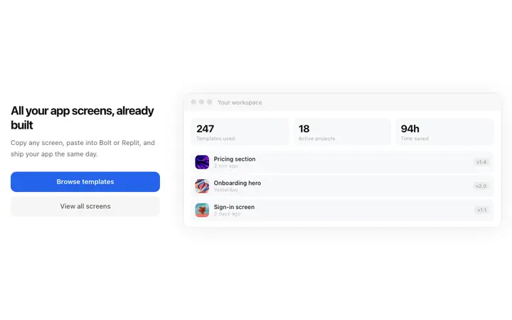
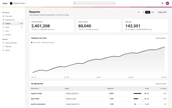
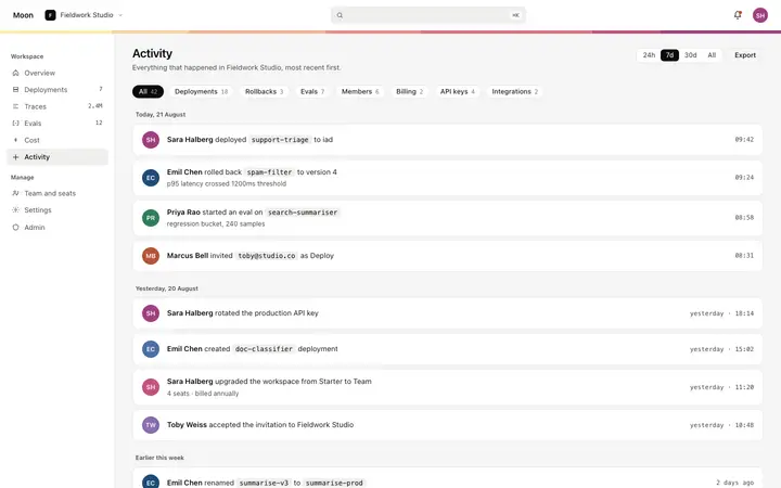
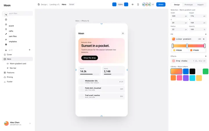
Analytics dashboards, metric detail views, activity feeds, and dashboard hero sections. Production ready HTML and CSS, copy directly into your vibe coding tool.
Frequently asked questions
What makes a good SaaS dashboard design?
A good SaaS dashboard design surfaces the user's most important information at a glance, creates a clear visual hierarchy between primary metrics and supporting data, and gives users an obvious next action at every moment of the session. The best dashboards are designed around the user's most frequent goal, not the completeness of the data.
How do you structure a SaaS dashboard layout?
A strong SaaS dashboard layout places the most important metric or status at the top left or center, groups related data into named sections, uses card based layouts to create clear separation between data types, and reserves the primary action button for the most important thing the user should do next.
What is the difference between a SaaS dashboard and an analytics dashboard?
A SaaS product dashboard is designed for regular end users and focuses on their personal progress, recent activity, and next actions. An analytics dashboard focuses on aggregate data, trends, and system health. Product dashboards prioritise motivation and next action clarity; analytics dashboards prioritise data density and comparison.
How many metrics should a SaaS dashboard show?
A SaaS product dashboard should show three to five primary metrics at the top, with supporting data below. More than five top level metrics fragments attention. If you have more data to show, use progressive disclosure: secondary metrics below the fold, a detail view for drill down.
How do you design a SaaS dashboard for new users?
A SaaS dashboard for new users needs to handle two states: the empty state before any data exists, and the partly filled state during the first week of use. The empty state should guide the user toward their first data generating action. The partial state should celebrate early progress.
What are the most common SaaS dashboard design mistakes?
The most common SaaS dashboard design mistakes are: showing every available metric in place of the most important ones, using the same visual weight for all data, designing for power users and overwhelming new users, and neglecting the empty and partial data states that every new user will encounter first.
What SaaS dashboard templates are available on BrowserMoon?
BrowserMoon has SaaS dashboard templates for analytics, project management, CRM, finance, ecommerce, AI generation, and design tools. All templates include metric cards, activity feeds, and chart sections built as self contained HTML you can copy into any vibe coding tool.