Metric detail dashboard template for SaaS
Metric detail dashboard template for analytics products, SaaS reporting, and developer tools. Use it as the screen someone opens after clicking a number they want to understand. Use this AI template with Claude Code, Replit, Lovable, ChatGPT Codex, Bolt, Cursor, or another coding tool.
About this vibe coding template
Metric detail dashboard template for the screen after the overview. It fits analytics products, SaaS reporting, developer platforms, growth tools, and any product where a headline number invites a question. Use it as the drilldown view. An overview tells someone what happened and this screen has to tell them why, which is the part people actually pay for. Minimal design. It works in Claude Code, Replit, Lovable, ChatGPT Codex, Bolt, and Cursor.
Build a full SaaS app or admin dashboard with this template design
A SaaS app or admin dashboard is dozens of screens sharing one shell, so one dashboard template can set the standard for the navigation, the spacing, and the card design on every screen after it. Copy the template, paste it into Claude Code, Replit, Lovable, ChatGPT Codex, Bolt, or Cursor, and send this alongside it.
Paste into Claude Code, Replit, Lovable, Bolt, or Cursor
Common questions about this template
What does this metric detail dashboard template include?
Three summary stat cards showing total, daily average, and peak values with period over period deltas, a current vs previous period area chart drawn in the markup with no charting library, and a breakdown table with deployment names, model labels, absolute counts, mini share bars, and period deltas.
How does the chart compare two periods in this SaaS dashboard template?
The current period is a filled area with a solid line. The previous period is a dashed line in a muted tone on the same axes. Both share the same date range scale, so the gap or convergence between them reads immediately without needing a label.
What does the breakdown table show in this SaaS dashboard template?
The breakdown table shows the total metric split across deployments. Each row has the deployment name, the model it runs on, the absolute count for the current period, a mini bar showing what share of the total that deployment accounts for, and the percentage delta versus the previous period. It answers the question of which deployments are driving the number.
How is this template different from the dashboard overview?
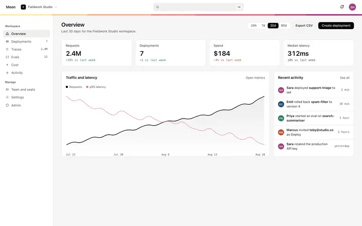
The dashboard overview is the home screen showing all KPI stats alongside an activity feed. This metric detail dashboard is a drilldown for a single metric, with granular stat cards, a period over period comparison chart, and a breakdown table. Navigate here when a user clicks a specific KPI on the overview.
Which tools work with this metric detail dashboard template?
Claude Code, Replit, Lovable, ChatGPT Codex, Bolt, and Cursor. Paste it in and replace the metric name, the stat card values, and the breakdown table rows with your product's data.
How do I build a full SaaS app or admin dashboard with this template?
Copy this coding template, paste it into Claude Code, Replit, Lovable, ChatGPT Codex, Bolt, or Cursor, and tell the tool to use it as the design system for your whole SaaS app or admin dashboard. It reads the type scale, spacing, colors, and component styling from the template, then applies them to every page it builds after that.
Use this AI coding template for
- ·Metric detail dashboard template for a SaaS product or developer tool
- ·Drilldown dashboard for a single metric with current vs previous period chart
- ·Metric breakdown table with share bars and period deltas for SaaS
- ·Vibe coding metric detail dashboard template
Works with every vibe coding tool
More from the SaaS dashboard set
5 pages
More dashboard templates
View all
More vibe coding SaaS templates
View all





Other templates you might like