Finance app transaction list template
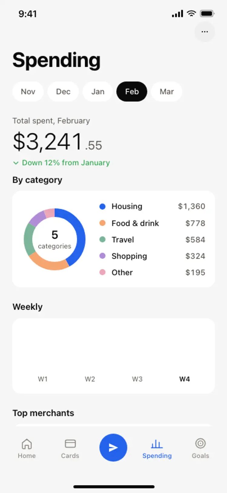
A finance app transaction list screen for iOS and Android. A month to date spending summary, filter chips for income, spending and pending, and transactions grouped by day with a merchant icon, category and a right aligned amount in blue for credits and black for debits. Built for Bolt, Lovable, and Replit.
About this app template
The transaction list is the screen a banking customer opens most, and it fails in two predictable ways: it shows a flat list with no sense of when things happened, and it makes every amount look the same. This template groups by day under quiet date labels, so today, yesterday and last Monday read at a glance without a single divider line. Amounts use tabular numerals so they stay aligned as they update, credits are blue and debits are black, and the month to date total sits at the top with a comparison against last month rather than alone. Filter chips cover all, income, spending and pending, because pending is the one people look for and most designs leave out. Paste it into Bolt, Lovable, or Replit and ask your AI to fetch real transactions from Plaid or a Supabase table.
Build a full banking or fintech app with this template design
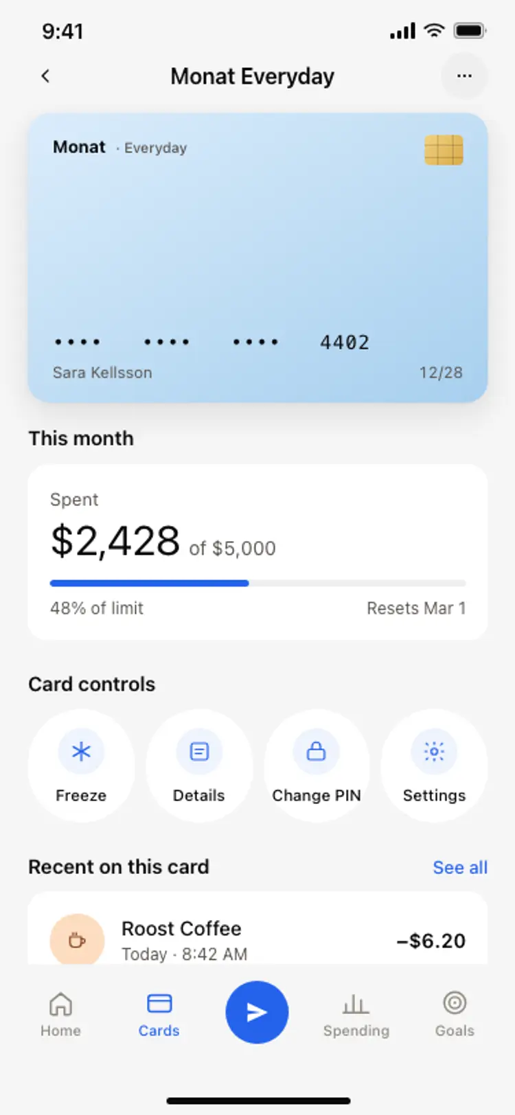
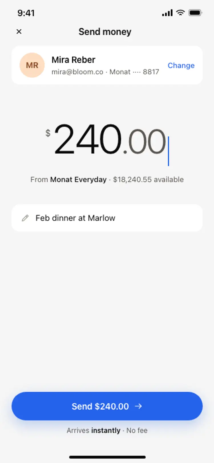
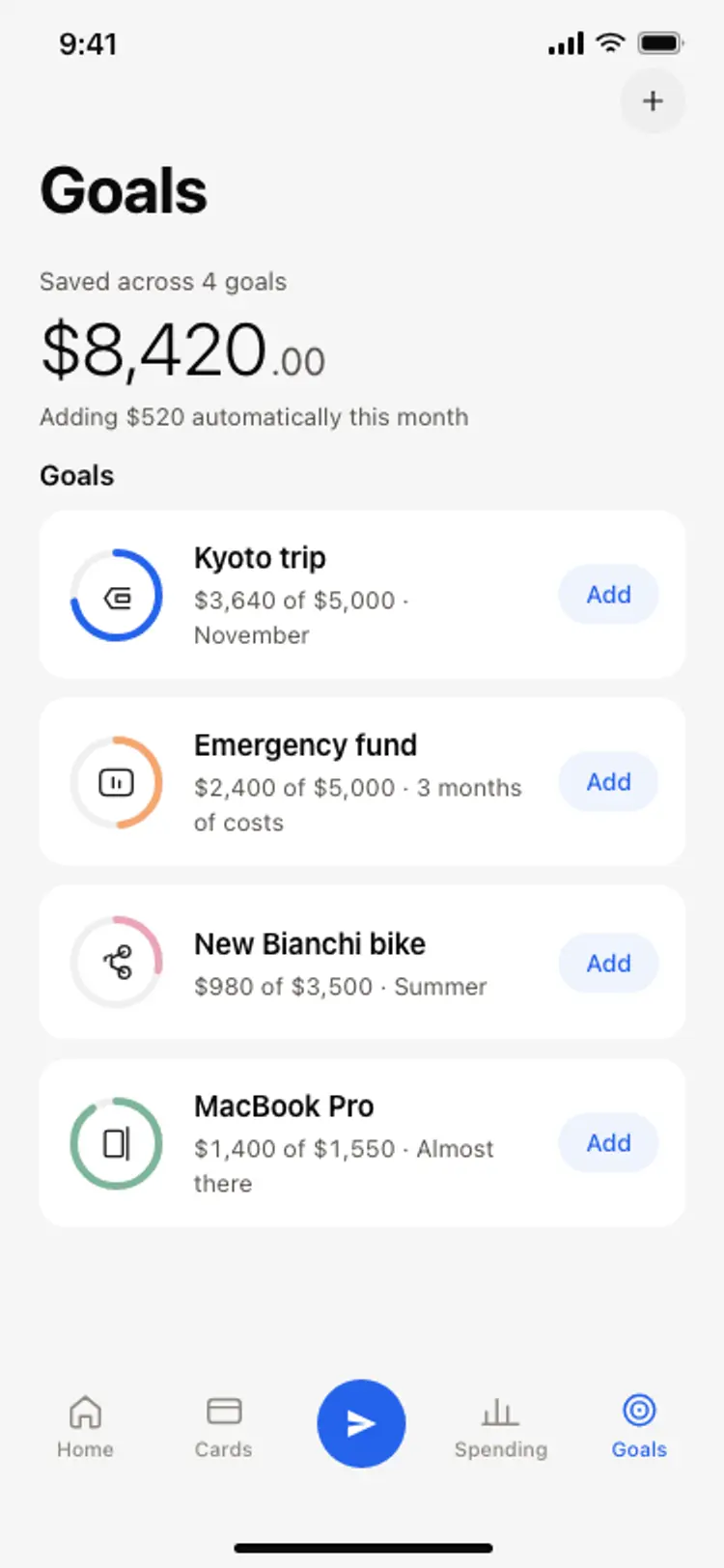
A finance app repeats balances, cards, transaction rows, and progress across many screens, so one screen can set the standard for every screen after it. Copy the template, paste it into Claude Code, Replit, Lovable, ChatGPT Codex, Bolt, or Cursor, and send this alongside it.
Paste into Claude Code, Replit, Lovable, Bolt, or Cursor
Common questions about this template
How do I connect real transactions to this screen?
Paste the template into Bolt, Lovable, or Replit and ask your AI to fetch from Plaid, Stripe, or a Supabase transactions table. Replace the static rows with a mapped list and group by date on the client so the day labels stay correct.
Why are the amounts right aligned with tabular numerals?
So the decimal points line up and the column does not jitter when values change. It is the single detail that makes a financial list feel accurate rather than approximate.
Does this screen use divider lines between rows?
No. Rows are separated by spacing and by the day labels, which is the cleaner modern approach and keeps a long list from looking like a table.
Can I add a search field to the transaction list?
Yes. Ask your AI to add a search input above the filter chips and filter the grouped list on merchant name and category. The layout leaves room for it without changing the rest of the screen.
Use this template for
- ·Finance and banking app transaction list templates for iOS and Android vibe coding
- ·Neobank spending history screens with grouped days for Bolt and Lovable
- ·Fintech app activity feeds with income and spending filters for Replit and Cursor
- ·Expense tracker transaction screens for Claude Code and ChatGPT Codex
More from the Finance app set
All 5 screens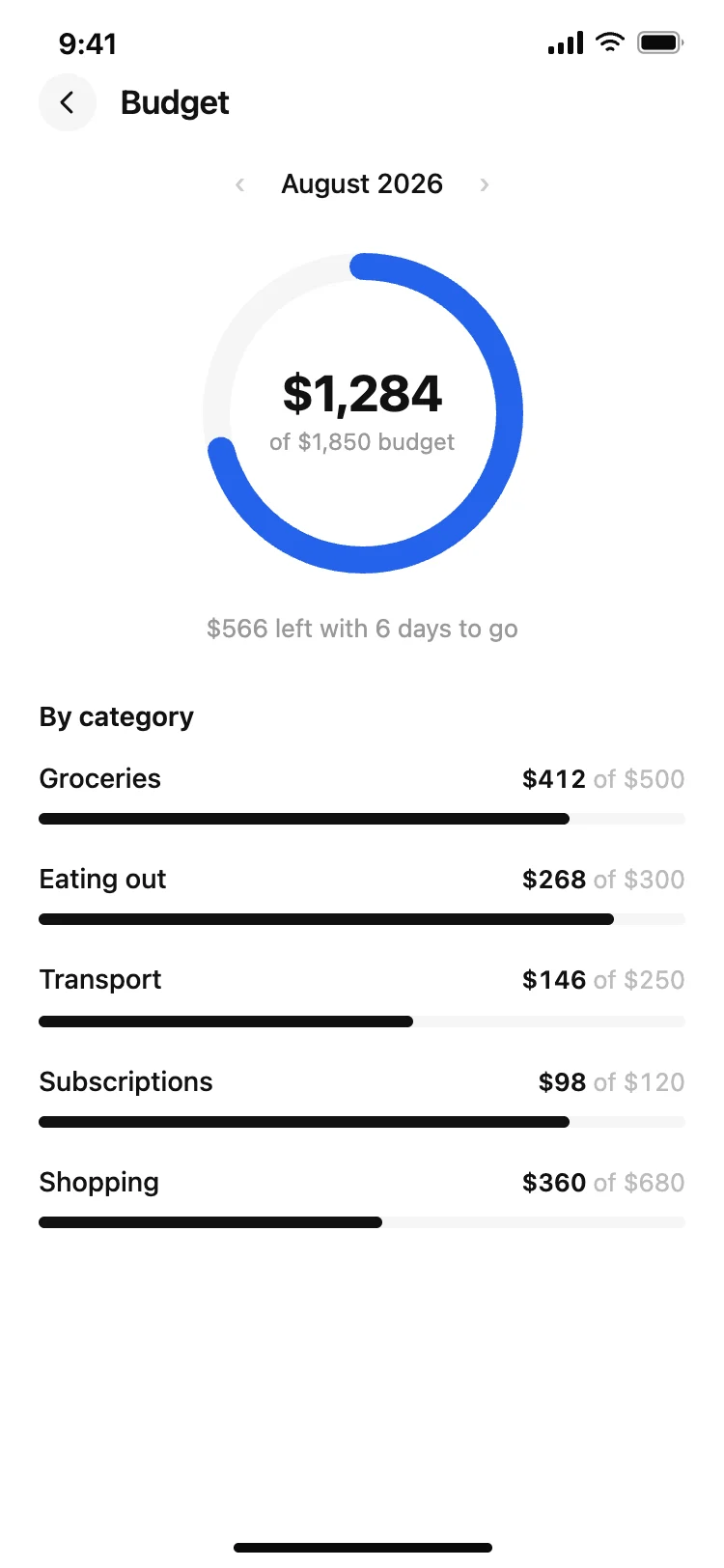
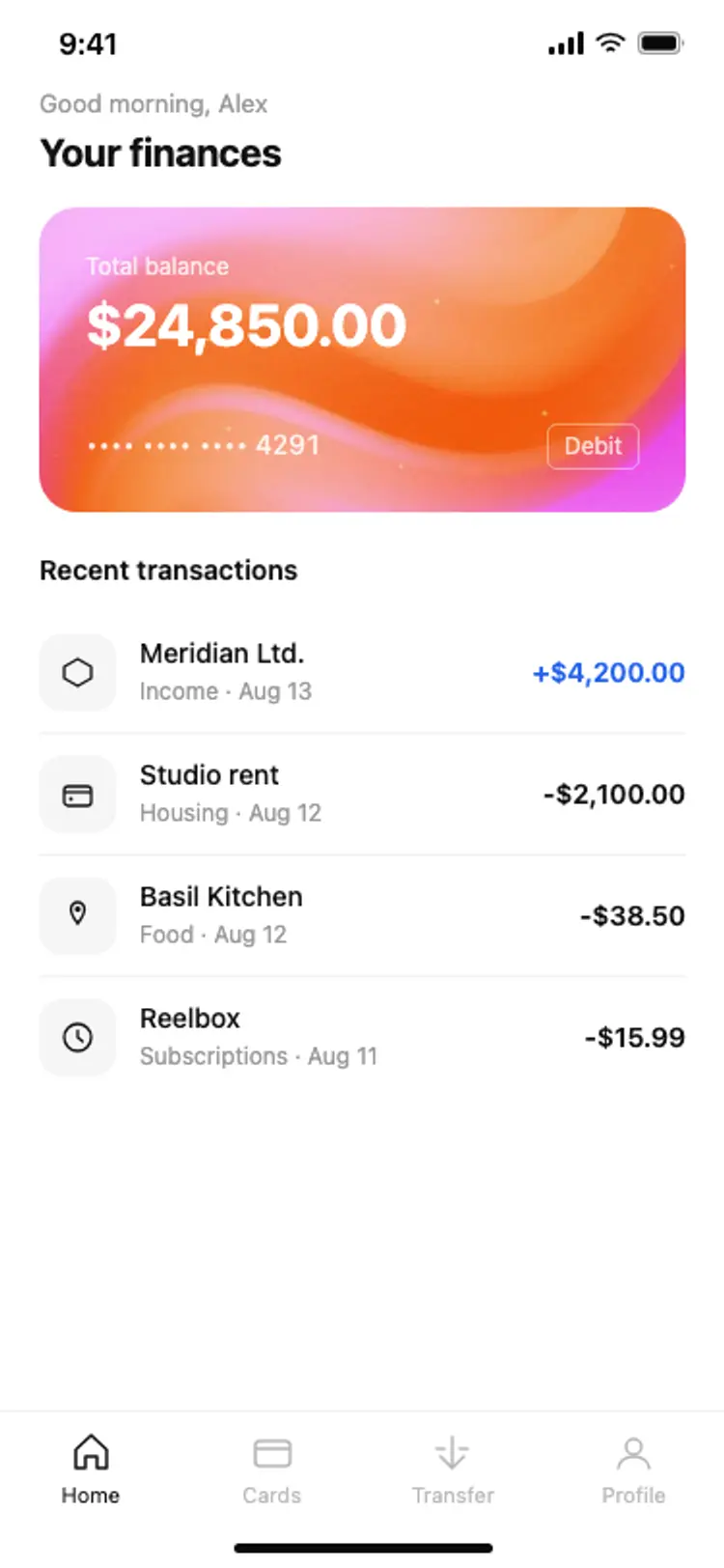
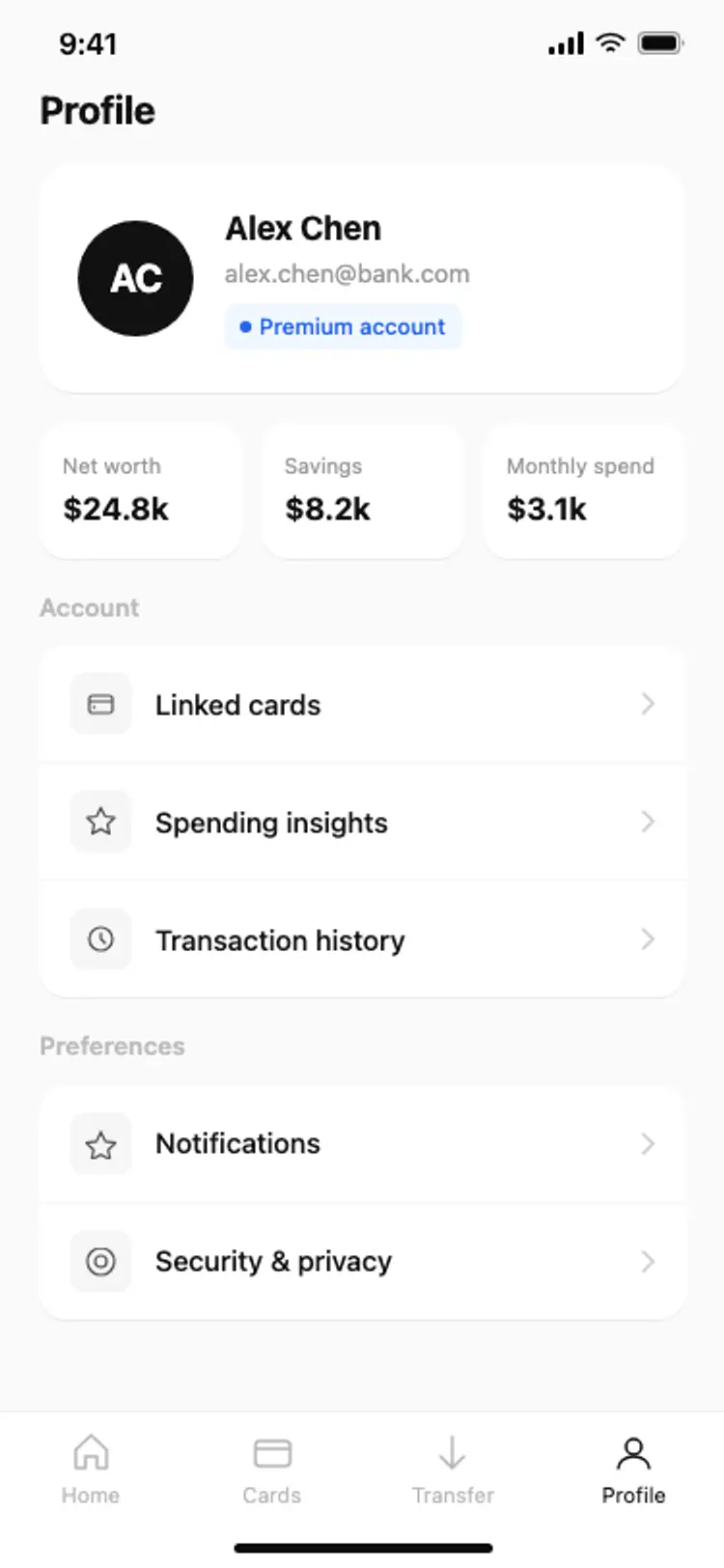
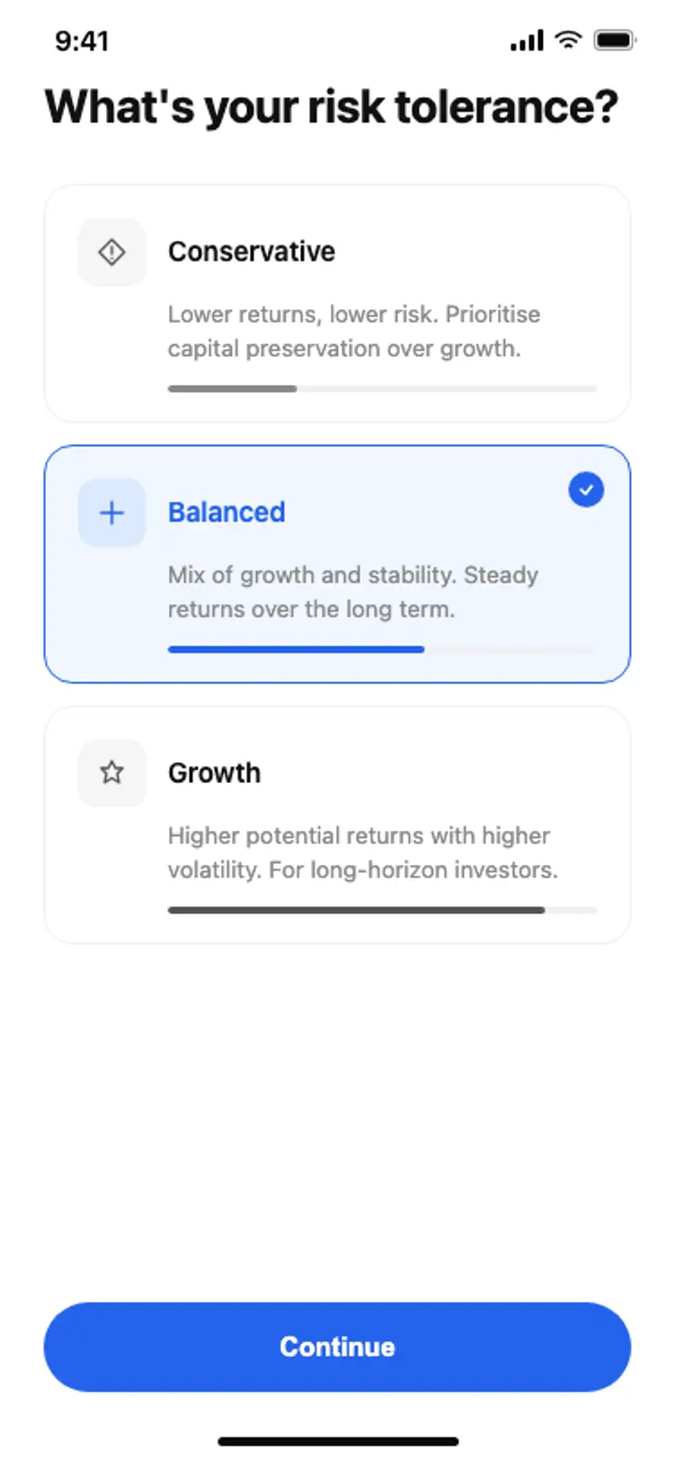
More finance app templates
View all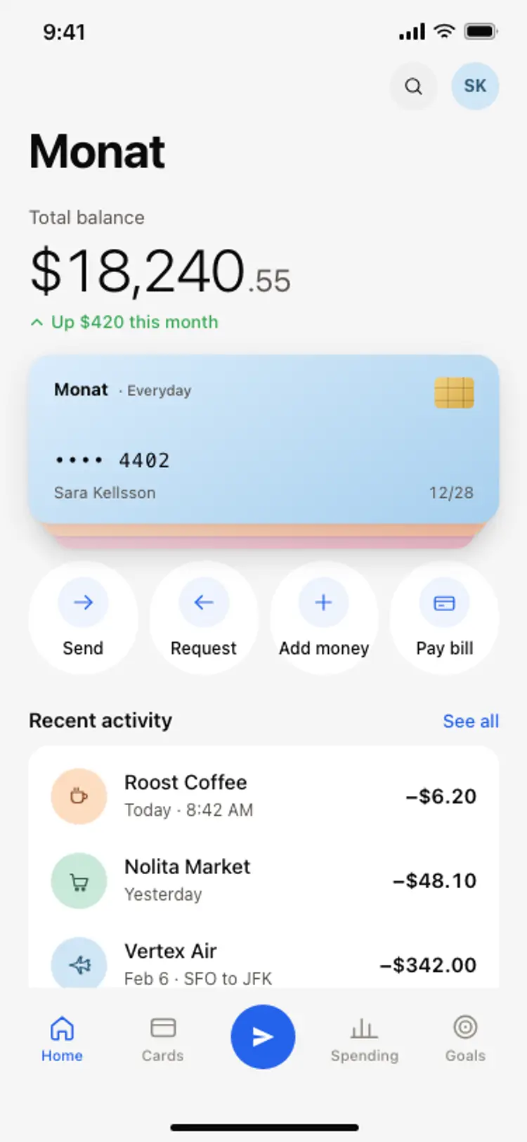
Other app templates you might like
See also
Browse app templates