Fintech SaaS landing page template
Landing pages · Hero
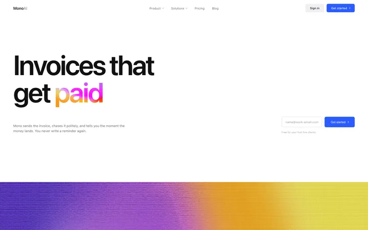
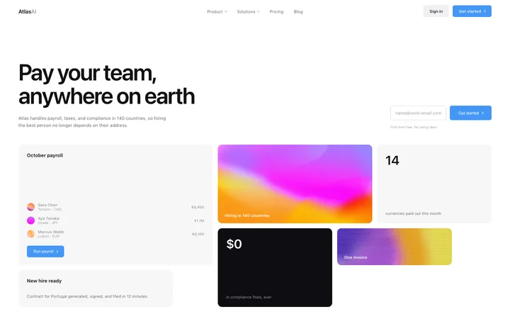
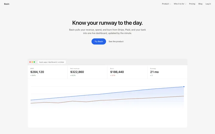
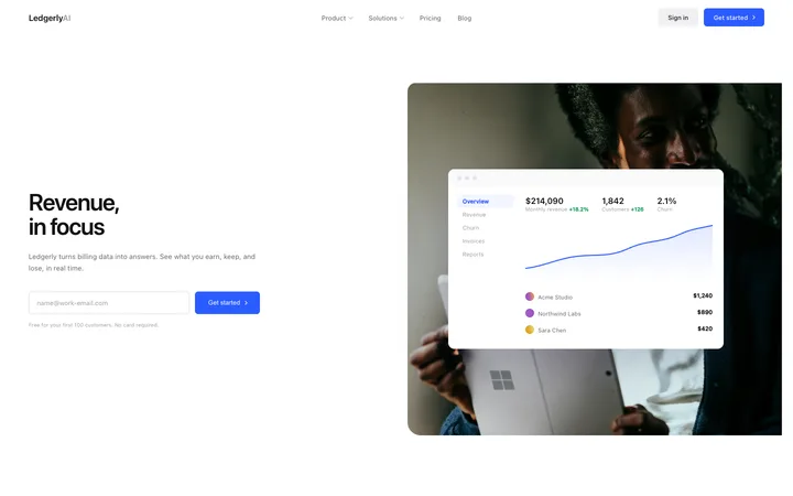
Build this design with AI →Real landing page designs for banks, payments, cards, payroll and finance tools, with what makes each one work. Build any of them in Lovable, Claude Code or Cursor.
Landing pages · Hero
Build this design with AI →Landing pages · Hero
Build this design with AI →Landing pages · Hero
Build this design with AI →Landing pages · Dashboard
Build this design with AI →Landing pages · Hero
Build this design with AI →Landing pages · Hero
Build this design with AI →Landing pages · Hero
Build this design with AI →Landing pages · Hero
Build this design with AI →Landing pages · Hero
Build this design with AI →Ecommerce · Hero
Build this design with AI →Hero · Landing pages
Build this design with AI →Hero · Cards
Build this design with AI →Every fintech landing page design above is a ready template. Browse and preview for free; copy the code with a BrowserMoon licence.
Get a licenceAsk Mon, the AI design assistant, to review your fintech landing page design and tell you what to fix first.
Design guides: Fintech landing page design examples · Why is my landing page not converting?
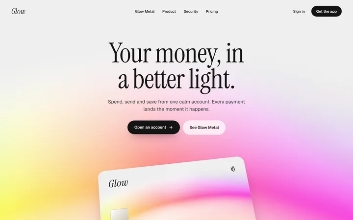
A fintech landing page has one job before any other: earn trust with someone's money. The best fintech landing page designs feel calm and precise, show the product and the money clearly, explain fees and security in plain words, and make the first step feel small and safe. The designs below are real fintech landing pages for neobanks, cards, payments and finance teams that you can study and build with an AI coding tool. These fintech website design examples cover neobank and banking websites, payment and card landing pages, payroll and expense tools and finance software, so you can find a fintech website design that fits your product.
Generous space, a restrained palette and steady typography feel safe. Busy pages with loud effects feel risky when money is involved.
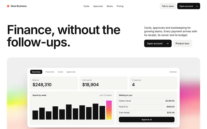
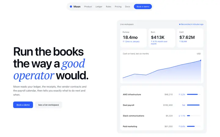
A real card, balance, invoice or dashboard screen makes the product concrete. Numbers should be large, aligned and easy to read.
Hidden costs are the first worry with any finance product. State fees, rates and limits plainly.
Say how money and data are protected and who regulates you, near the main button, without a wall of badges.
Open an account, get a card or see a demo. Make the first action feel quick and reversible.
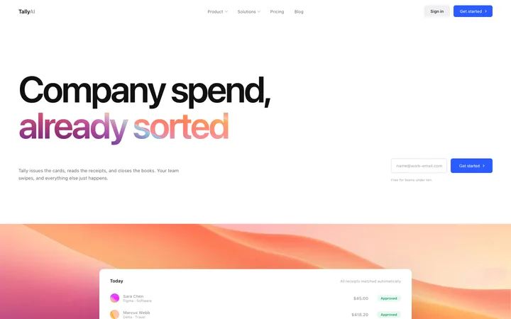
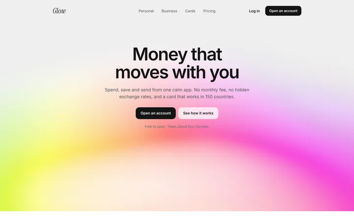
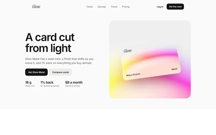
Consumer fintech pages, for neobanks, cards and savings apps, lead with a product image like a card or phone screen and a single benefit, with app store buttons close by. Business finance pages, for spend management, payroll and invoicing, lead with the workflow and the time or money saved, and usually offer a demo.
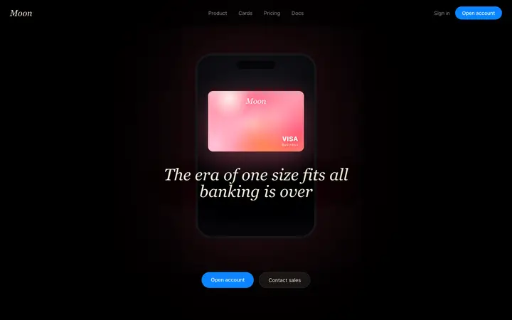
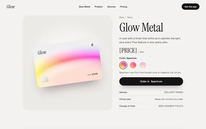
Card product pages put the physical or virtual card at the centre with its key features and fees, much like a premium product page. Payment and infrastructure pages speak to developers and finance teams together, pairing the business benefit with API and integration detail.
Open any fintech landing page design above to see it live and full size.
Copy the template code from the design's page. It is plain HTML and CSS.
Paste it into Lovable, Bolt, Claude Code, Cursor or v0 and ask for it in your stack.
Ask the tool to swap in your copy, brand colours and links, keeping the layout and spacing.
Visitors assume the worst when costs are vague. Clear pricing converts better than clever pricing.
Generic photos say nothing about the product. Show the card, the app or the dashboard.
Ten logos and seals in a row look defensive. A short, specific line on security works better.
Asking for personal details too early stops people. Show what they get, then ask.
It feels calm and trustworthy, shows the product and money clearly, states fees and security in plain words, and makes the first step small.
Show the real product, explain fees and how money is protected, mention regulation and partners briefly, and keep the design calm and consistent.
Restrained palettes with one accent colour work best. Many fintech sites use deep blues, greens or black for trust, but clarity matters more than the exact colour.
Yes. Fees and rates are the first question people have about a finance product, and hiding them costs trust.
Yes. Open any design, copy the template and paste it into Lovable, Bolt, Claude Code or Cursor with your own product and copy.
You can preview every design on this page. Copying the template code into your project needs a BrowserMoon licence.
More design ideas