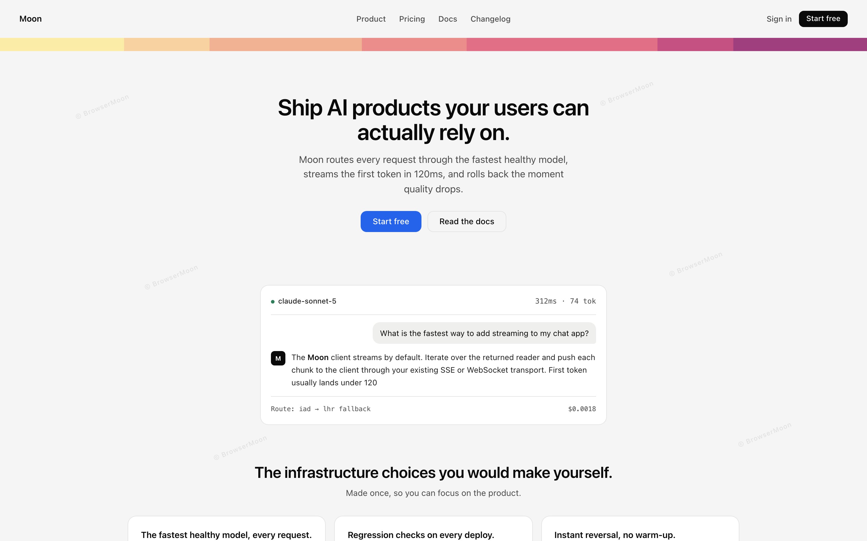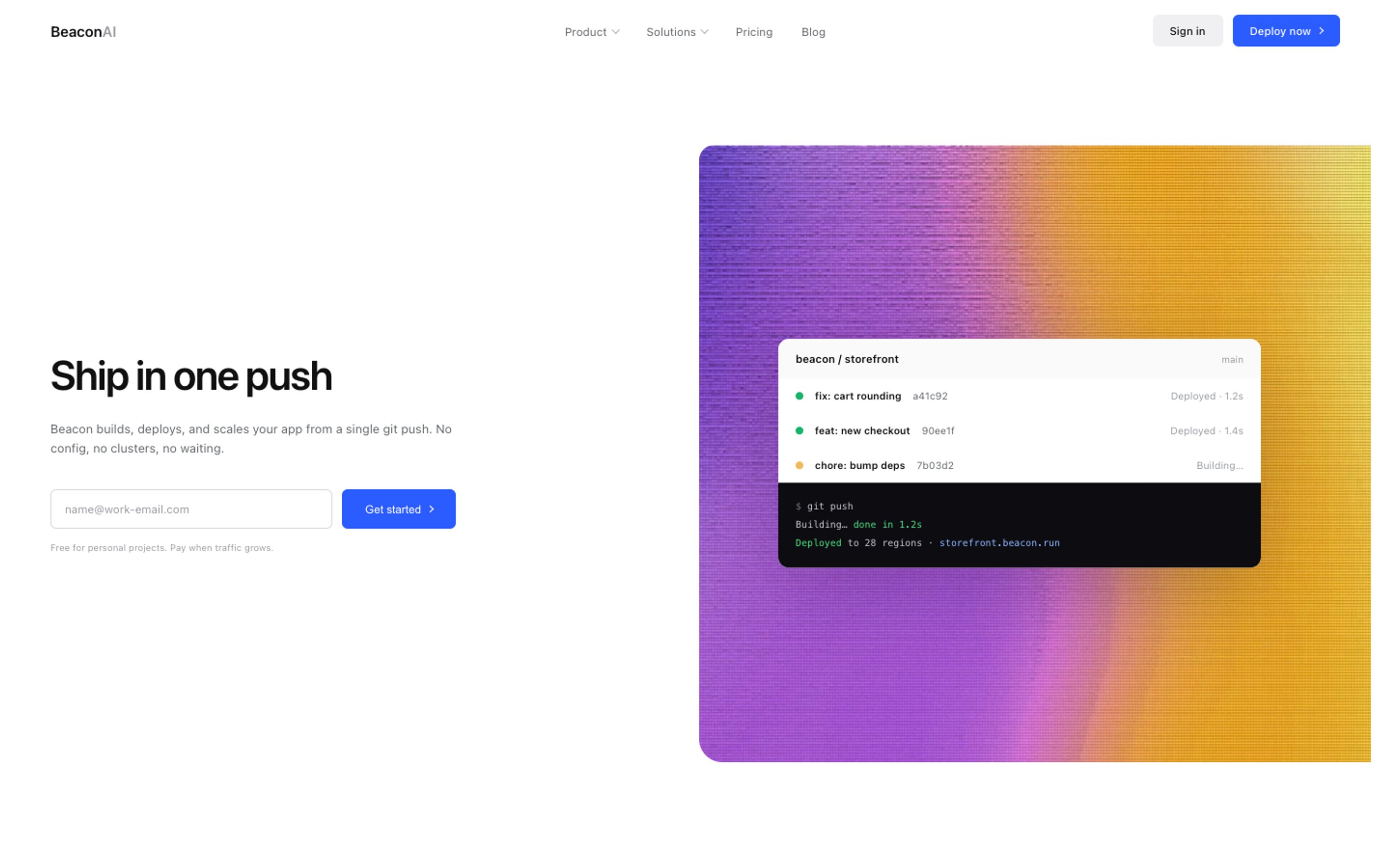
We measured the homepages of 196 SaaS and AI companies, from Stripe, Linear, Notion and Figma to Anthropic, Mistral, ElevenLabs and Cursor, to see what modern website design actually looks like in numbers: headline sizes, fonts, body text, dark mode, gradients and buttons. Most website design statistics people still quote come from studies that are several years old. These are from November 2026, and the full data is open for anyone to download.
Key website design statistics for 2026:
• The typical homepage headline is 64px, 6 words long, with a line height of 1.08.
• 75% of headlines use tight, negative letter spacing.
• 84% of companies use their own or a less common font for headlines. Only 9% use Inter and 5% use Geist.
• Half of sites set body text at 18px or more.
• 36% of homepages are dark. Only 33% of AI company homepages are dark.
• 53% use a gradient somewhere in the first screen.
• The typical main button is 46px tall, and blue is the most common button colour (29%).
• "Get started" is the most common button text, and 30% of buttons say "free".
The typical SaaS homepage in numbers
| Measure | Typical homepage (median) |
|---|---|
| Headline size | 64px (middle half: 52 to 72px) |
| Headline length | 6 words |
| Headline line height | 1.08 |
| Headline letter spacing | tight, about -0.025em (75% of sites) |
| Body text size | about 18px |
| Main button height | 46px |
| Navigation bar height | 72px |
Headlines: big, short and tight
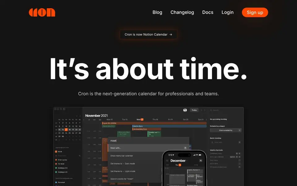
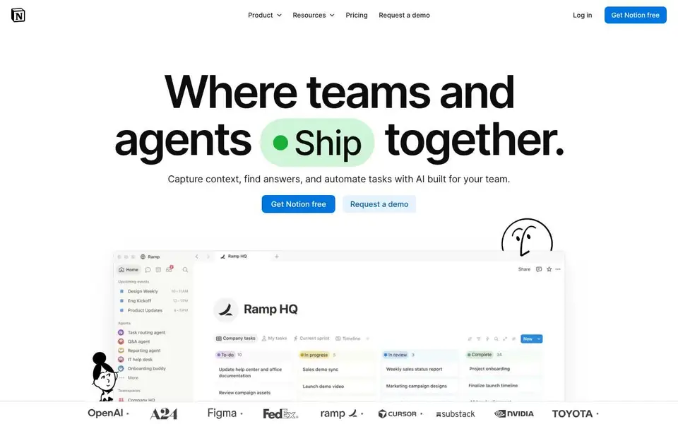
The median homepage headline is 64px on a desktop screen, and half of all sites fall between 52px and 72px. SaaS sites go slightly bigger (64px) than AI companies (60px). At the extremes, Pitch uses a 180px headline and Cron 140px.
Headlines are short: the median is 6 words and 82% use 8 words or fewer. They are set tight: 75% use negative letter spacing, typically around -0.025em, with a line height close to 1.1. That combination is what makes a headline look designed rather than default, and it is the first thing missing from most AI built pages.
Weight is split almost evenly: 35% of headlines are light or regular (400 or less), 29% are medium and 36% are bold (600 or more). Bold is not the only way to look confident; Stripe's headline is weight 300.
Fonts: most companies use their own
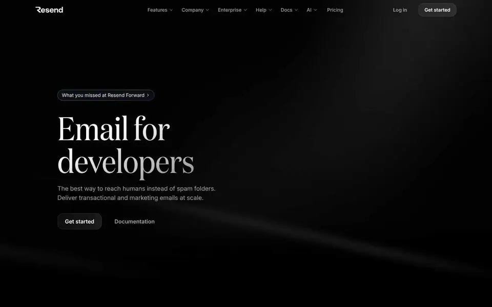
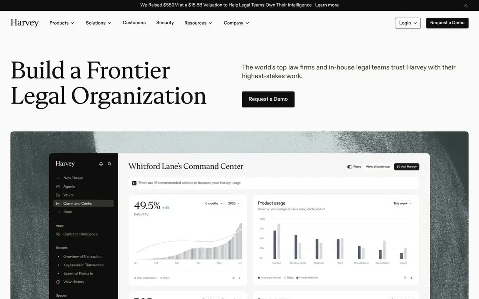
84% of headline fonts are a brand's own typeface or a less common font, like Söhne at Stripe, Aeonik, Suisse Intl or Mona Sans. Inter, the default of countless AI generated sites, appears in only 9% of headlines, and Geist in 5%. Serif headlines are rare, at 5% (HubSpot, Resend, Incident.io and Harvey among them).
What it means for you: using the same default font as everyone else is the fastest way to look generic. Picking one distinctive font for headlines does more than any other single change. More in our guide to stopping AI UI looking generic.
Body text: bigger than you think
The median body text is about 18px, and half of all sites use 18px or more. Only 23% use 14px or less. If your landing page body text is 14px, it is smaller than three quarters of the sites in this study.
Our 560+ design templates already use these proportions: big tight headlines, readable body text and one clear button.
Get a licenceDark mode: less common than it looks
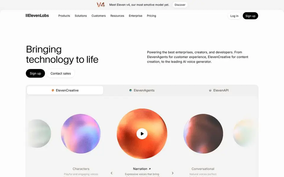
36% of homepages are dark. The surprise is AI companies: only 33% are dark, slightly fewer than SaaS. The dark, glowing AI homepage is a strong trend, but most AI companies still choose light. See our dark mode website design guide before you pick.
Gradients are back
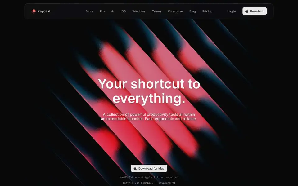
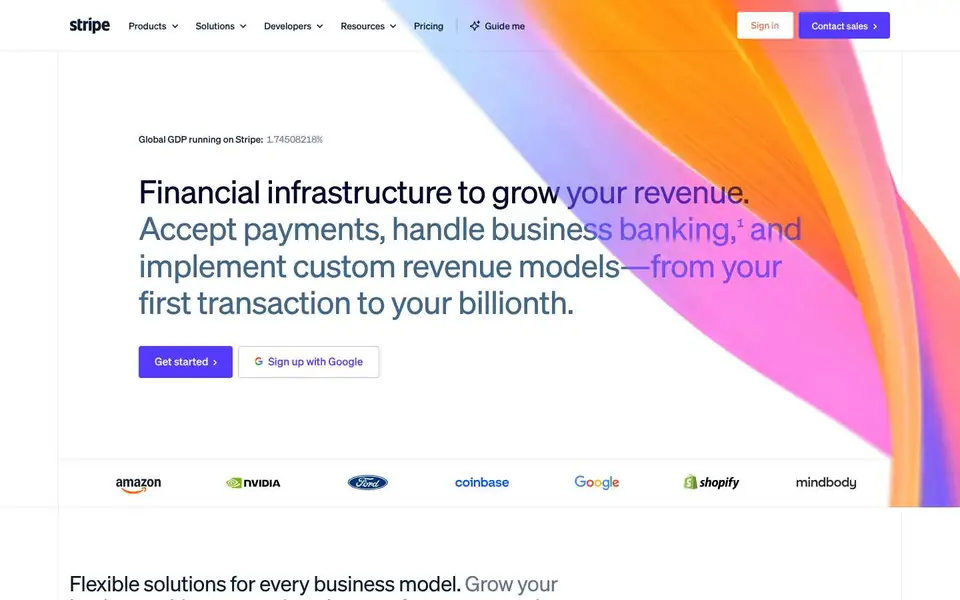
53% of homepages use a gradient somewhere in the first screen, from Stripe's moving gradient to soft glows behind a headline. If you want one, our animated gradient backgrounds and Stripe gradient pages show how.
Buttons: blue, 46px and slightly rounded
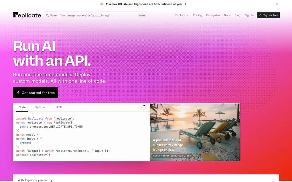
The typical main button is 46px tall, and half fall between 40px and 51px. Slightly rounded corners (3 to 8px) are the most common shape at 45%, pill buttons are 29%, and square buttons are only 8%.
Blue is still the most common main button colour at 29%, followed by white (22%) and black (21%). Black and white buttons together outnumber blue, a sign of how many sites now use a mostly monochrome design with one accent.
Button text: "Get started" is the most common text (21% of buttons include it), followed by "Get started for free", "Start for free" and "Start building". 30% of buttons mention "free" and 9% ask for a demo. More in our CTA section design guide.
Mobile website design statistics
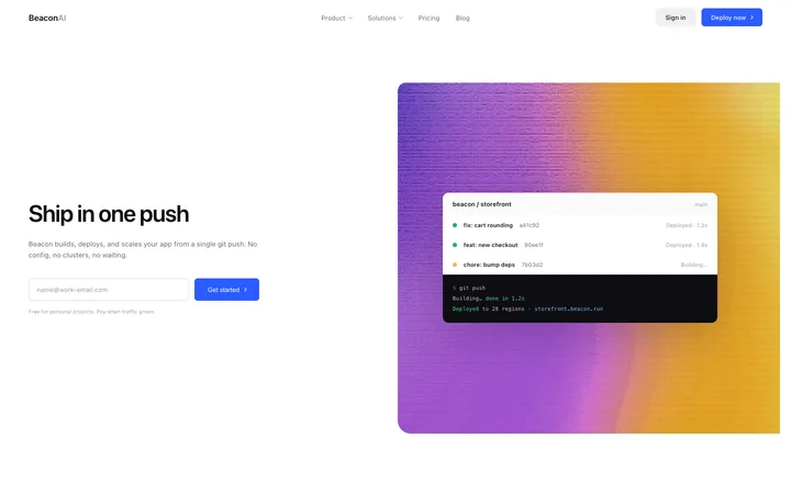
We loaded the same 196 homepages on a phone sized screen (390 by 664 pixels, like an iPhone 13) to see what changes. The short version: headlines shrink to about two thirds of their desktop size, body text drops to 16px, and more than a quarter of sites push the main button below the first screen.
| Measure | Desktop | Phone |
|---|---|---|
| Headline size | 64px | 40px (middle half: 32 to 44px) |
| Headline lines | 1 to 2 | 3 (most use 2 or 3) |
| Body text | about 18px | 16px |
| Main button height | 46px | 44px |
| Navigation bar height | 72px | 66px |
Headlines: the median mobile headline is 40px, and half of sites fall between 32px and 44px. That is about 0.6 times the desktop size. AI companies go slightly smaller (37px) than SaaS (40px). The headline usually wraps to 2 or 3 lines, and on 99% of sites it fits fully in the first screen.
Body text: 16px is the standard on phones. Only 27% of sites go to 14px or below.
Buttons: the typical main button is 44px tall, but 46% are shorter than 44px, the minimum touch target size Apple recommends. 31% stretch the button to the full width of the screen. And on 28% of sites the main button is not visible without scrolling.


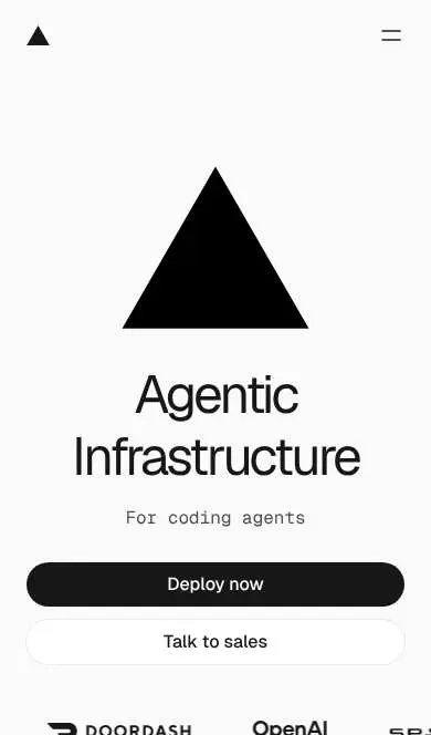
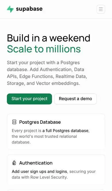
What to copy: set your mobile headline around 36 to 44px and let it wrap to 2 or 3 lines, keep body text at 16px, make buttons at least 44px tall, and check that your main button shows on the first screen of a phone. Our guide to making a vibe coded website mobile responsive shows how to fix each one with AI.
Download the mobile data: mobile measurements as CSV.
What to copy from this study
1. Make your headline 52 to 72px on desktop, 6 words or fewer if you can, with a line height around 1.1 and slightly tight letter spacing.
2. Use one distinctive headline font instead of the default everyone else uses.
3. Set body text at 16 to 18px.
4. Choose dark mode for your audience, not because it looks like an AI product. Most AI companies don't.
5. Make your main button about 46px tall, slightly rounded, in your one accent colour, with text that says what happens next.
Want a second opinion on your own page? Ask Mon, the AI design assistant for design feedback, or start from our hero section design examples.
How we measured
We loaded the homepages of 218 well-known SaaS and AI companies in November 2026, in a desktop browser at 1440 by 900 pixels. 22 were left out because they blocked automated visits or did not load, leaving 196 sites: 121 SaaS and 75 AI companies. For each site we measured the main headline (the first visible H1, or the largest text when there was none), the first paragraph of body text, the page background behind the headline, gradients in the first screen, and the first filled button in the first screen, ignoring cookie banners and skip links. Sizes are as rendered on that screen, so sites that scale type with the window would show different numbers on other screens. Font names are the first font each site asks for. The mobile measurements used the same 196 sites at 390 by 664 pixels; the main button there is the first filled button below the headline, or the first on screen when there is none, so on a few sites it is a header button. Percentages are rounded. Screenshots were taken during the study and are shown for commentary; all names and designs belong to their owners.
Download the data: the full measurements for every site are open for anyone to use. Download the CSV, or get it from the website design statistics repository on GitHub, Hugging Face or Kaggle. If you use these statistics, please link to this page as the source.
Frequently asked questions
What is the average headline size on a website?
In our study of 196 SaaS and AI homepages, the median homepage headline was 64px on a desktop screen, and half of sites used between 52px and 72px.
What font size should body text be on a website?
About 16 to 18px. The median in our study was about 18px, and half of the sites used 18px or more. Only 23% used 14px or less.
What is the most popular font for websites in 2026?
Among headline fonts, Inter was the most common named font at 9%, then Geist at 5%. But 84% of companies used their own or a less common font.
How many websites use dark mode?
36% of the 196 homepages we measured were dark. Only 33% of AI company homepages were dark, slightly fewer than SaaS at 37%.
What colour should a call to action button be?
Blue was the most common main button colour at 29%, followed by white and black. More important than the colour is using one accent colour that stands out from the rest of the page.
What font size should a headline be on mobile?
About 36 to 44px. The median mobile headline in our study was 40px on a 390px wide phone screen, about 0.6 times the desktop size.
What size should body text be on mobile?
16px. It was the median on phones in our study of 196 homepages, and only 27% of sites used 14px or less.
How tall should a button be on a website?
The median main button in our study was 46px tall, and half were between 40px and 51px.
Related templates
Landing page templates
Designs built on these patterns.
Hero section design
Examples and best practices.
Website design ideas
Real designs by page and section.
Stripe website design
Why it works and how to build it.
Dark mode website design
When dark mode works.
DESIGN.md examples
Turn a design into rules for AI.