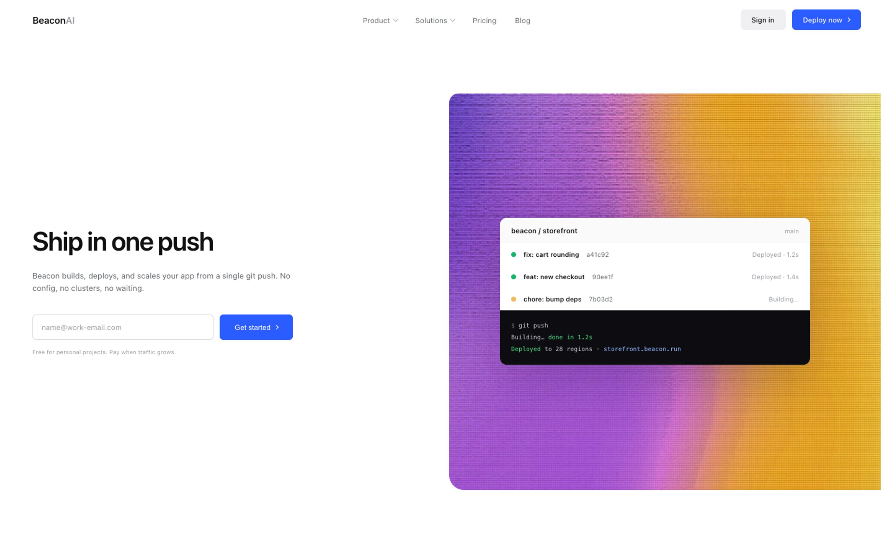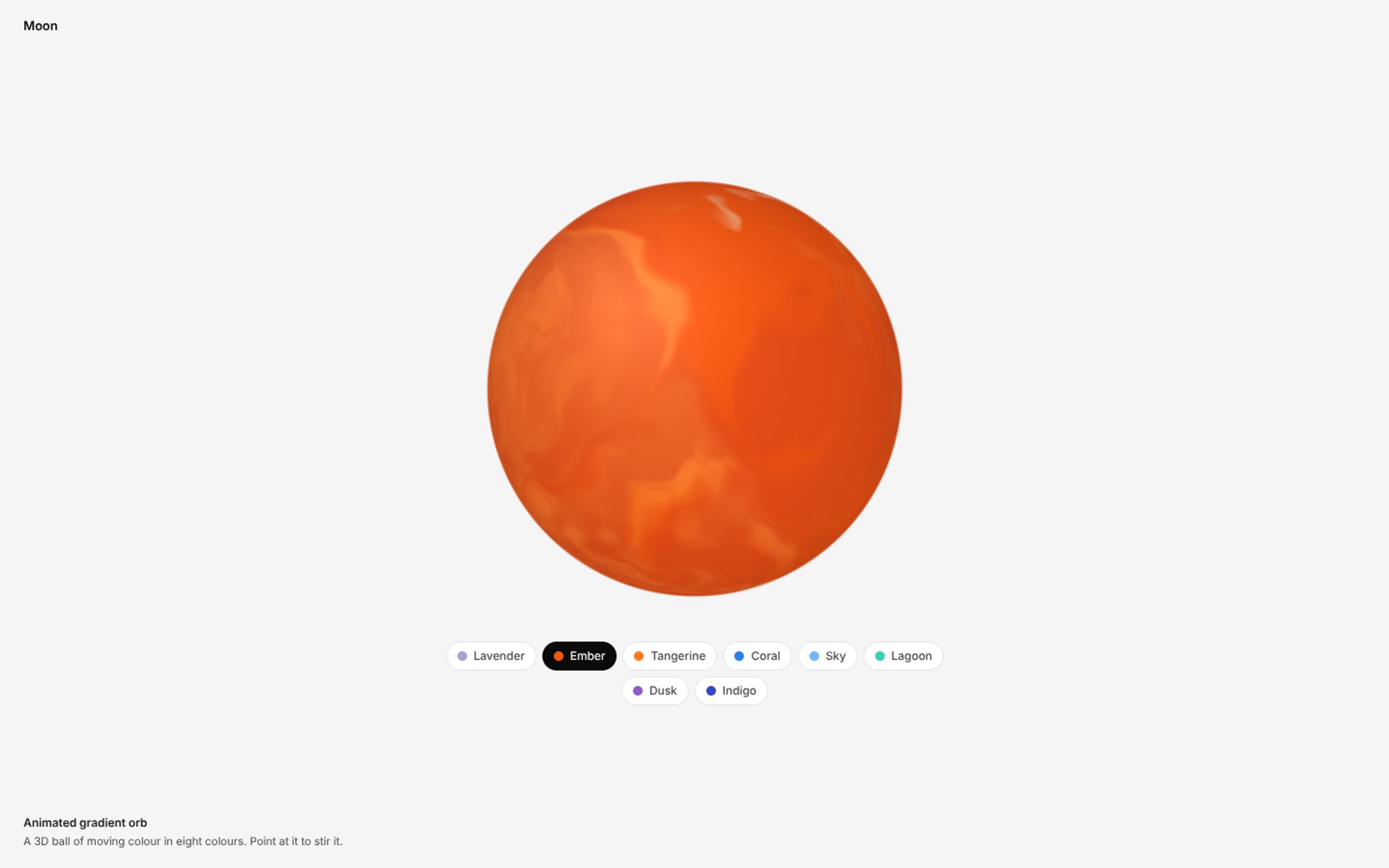
A gradient orb is a round ball of soft, blended colour, and it is one of the most popular hero images on websites right now. AI products use a glowing orb as the face of their assistant, and brands use one next to the headline. You can make a gradient orb with a few lines of CSS, make it move, or skip the code and paste a finished one into your site.
Quick answer: make a round element with border-radius: 50%, give it a radial-gradient background with a light spot in the top left, and add a soft shadow. For a glowing orb background, blur a gradient circle with filter: blur(). For an animated orb, spin a blurred conic-gradient inside it. Or copy a ready made animated gradient orb.
1. A simple CSS gradient orb
The trick is a radial gradient that starts light where the light hits the ball and gets darker towards the edge. Moving the centre of the gradient to the top left is what makes it look 3D.
.orb {
  width: 240px;
  aspect-ratio: 1;
  border-radius: 50%;
  background: radial-gradient(circle at 30% 30%,
    #fff 0%, #ffb27a 18%, #f2560f 55%, #8a1f3c 100%);
  box-shadow: 0 30px 60px -20px rgba(242, 86, 15, .45);
}
Swap the four colours for your brand colours. Keep the first one almost white, the last one the darkest, and the shadow in the same colour as the ball.
2. A glowing orb background
A glowing orb behind a headline is not a ball at all, it is a gradient circle that fades to transparent, blurred until it looks like light. Put it behind your hero text with position: absolute.
.glow {
  position: absolute;
  width: 480px;
  aspect-ratio: 1;
  border-radius: 50%;
  background: radial-gradient(circle,
    #a9a0d2 0%, #f39a43 45%, transparent 70%);
  filter: blur(60px);
  opacity: .8;
  pointer-events: none;
}
Keep the text on top readable: a glow works best in the corner or behind the image, not straight behind small grey text. For a ready made version, see the glowing orb hero background, or make your own in the glow gradient maker.
Skip the tuning: get 560+ design templates, including animated gradient orbs, ready to paste into Claude Code, Lovable, Bolt or Cursor.
Get a licence3. An animated gradient orb
To make the colours move inside the ball, put a blurred conic gradient inside the orb and spin it. A second layer adds the light spot and the shadow so it still looks round.
.orb {
  position: relative;
  overflow: hidden;
  width: 240px;
  aspect-ratio: 1;
  border-radius: 50%;
  animation: float 6s ease-in-out infinite;
}
.orb::before {
  content: "";
  position: absolute;
  inset: -25%;
  background: conic-gradient(from 0deg,
    #f2560f, #fc7d2c, #fad7b2, #d6431a, #f2560f);
  filter: blur(24px);
  animation: spin 8s linear infinite;
}
.orb::after {
  content: "";
  position: absolute;
  inset: 0;
  border-radius: 50%;
  background:
    radial-gradient(circle at 30% 28%, rgba(255,255,255,.55), transparent 40%),
    radial-gradient(circle at 70% 80%, rgba(0,0,0,.25), transparent 55%);
}
@keyframes spin { to { transform: rotate(360deg); } }
@keyframes float {
  0%, 100% { transform: translateY(0) scale(1); }
  50% { transform: translateY(-12px) scale(1.04); }
}
@media (prefers-reduced-motion: reduce) {
  .orb, .orb::before { animation: none; }
}
The last rule matters: some people turn off motion in their settings, and a moving orb should stand still for them.
4. A glowing glass orb
A glass orb is a pale, frosted ball with a warm light inside it. It looks best on a black background. Stack two radial gradients: a small bright one for the light, and a grey to white one for the glass.
body { background: #000; }
.glass-orb {
  width: 260px;
  aspect-ratio: 1;
  border-radius: 50%;
  background:
    radial-gradient(circle at 50% 55%,
      rgba(255,130,50,.95) 0%, rgba(255,130,50,0) 32%),
    radial-gradient(circle, #8f8f97 0%, #d9d7d7 70%, #fff 100%);
  box-shadow: 0 0 40px rgba(255,255,255,.2);
  animation: breathe 5s ease-in-out infinite;
}
@keyframes breathe {
  50% { filter: brightness(1.12) saturate(1.2); }
}
This gives you the look. For a glow that drifts, changes shape and opens into an arc of light, CSS runs out of road and you need a shader, which is what the glowing glass orb template uses.
CSS orb or a live orb: which one to use
Use CSS for a still orb, a soft glow behind a headline, or a simple float and spin. It is a few lines and works everywhere.
Use a live orb when you want marbled colour that really flows, swirls that wrap around the ball, or an orb that reacts to the mouse. These are drawn with a small WebGL shader. They still weigh only a few kilobytes and need no Three.js, but they are not something you write by hand in an afternoon. Our gradient orb templates are made this way.
Use a video or PNG when the orb goes into a slide, a social post or an app store image. The AI orb maker exports both.
How to add a gradient orb with AI coding tools
Paste the CSS above, or a template, into Claude Code, Lovable, Bolt, Cursor or Replit and say exactly where it goes: "Add this orb to the right of the hero headline, 320px wide, and match it to our brand colours #… and #…". Name the place, the size and the colours. "Add a cool orb" gets you a generic one.
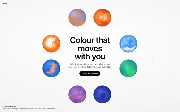
For a whole first screen built around orbs, start from the hero section with animated gradient orbs and change the headline. More hero ideas are in our hero section design guide.
Common gradient orb mistakes
1. Flat colour. A radial gradient centred in the middle looks like a disc, not a ball. Move the light to the top left.
2. Too many colours. Two or three colours from one family look rich. Five unrelated colours look like a beach ball.
3. Text on top of the glow. Keep headlines and buttons off the brightest part, or they become hard to read.
4. Motion that never stops. Respect reduced motion, and pause big animations when they scroll off screen.
5. A huge video file. A looping orb video can weigh megabytes. CSS or a small shader does the same job in kilobytes.
Frequently asked questions
How do I make a gradient orb in CSS?
Make a round element with border-radius: 50% and give it a radial-gradient background that is light in the top left and dark at the edge. Add a soft shadow in the same colour.
How do I make a glowing orb background?
Use a circle with a radial gradient that fades to transparent, blur it with filter: blur(60px) and place it behind your content with position: absolute.
How do I animate a gradient orb?
Spin a blurred conic gradient inside the orb with a CSS animation, and add a gentle float. Turn the animation off for people who prefer reduced motion.
Can I make a gradient orb without code?
Yes. Copy a ready made gradient orb template into your page or your AI coding tool, or make a video or PNG orb with an AI orb maker.
Will an animated orb slow down my website?
Not if it is CSS or a small shader. Avoid large looping videos, and pause the animation when it scrolls out of view.
Related templates
Gradient orb templates
Animated orbs ready to paste.
Animated gradient orb
A 3D orb of moving colour in 8 colours.
Glowing glass orb
A frosted glass orb for dark websites.
Gradient orbs hero
Eight orbs around your headline.
AI orb maker
Make an orb video or PNG.
Stripe-style gradient hero
Build a moving gradient hero.