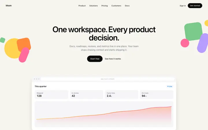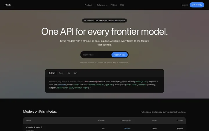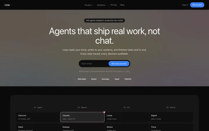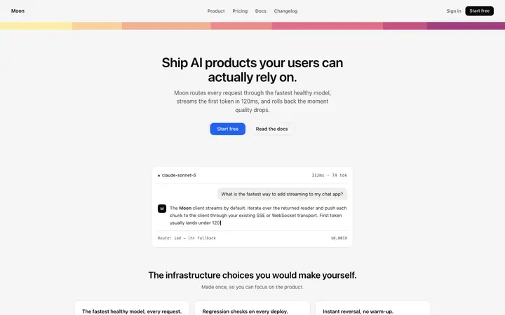
AI product landing page template for SaaS
Landing pages
Build this design with AI →You built your app with Lovable, Bolt, v0, Cursor or Claude Code, it works, and it looks exactly like every other AI app. That is not bad luck. AI builders fall back on the same defaults when you do not give them a direction. Here is how to spot those defaults and replace them, so your app looks designed instead of generated.
Look at your app with fresh eyes, or show it to someone who has never seen it. If three or more of these are true, it reads as a default AI app.
A violet or indigo gradient on the hero, the buttons or the logo is the most common AI default of all.
Centred headline, centred text, centred cards, all the way down the page.
An icon, a bold title and two lines of text, three times in a row, with the same rounded corners and shadow.
Headlines like "Supercharge your workflow" or "The future of productivity" that could sit on any product.
Match the feedback you hear to the most likely cause, then jump to the fix below.
| What you see | Likely cause |
|---|---|
| "Looks like every other AI app" | Default colours, fonts and layout from the builder |
| "Looks a bit cheap" | Inconsistent spacing, shadows and corner sizes |
| "I don't get what it does" | Generic copy and no real product on screen |
| "Looks fine but forgettable" | No signature visual, nothing that is yours |
| "Works on my laptop, messy on my phone" | Layout never checked at phone width |
Each cause comes with what to look for, the fix, and where to find a pattern that already does it right.
Without a style, the builder picks the safest average of everything it has seen. That average is the generic AI look.
Fix: give it a design system before you build: colours, fonts, spacing and corner sizes in one file it reads first. Write a DESIGN.md →
Purple to blue gradients appear in so many AI apps that visitors now read them as "made by AI".
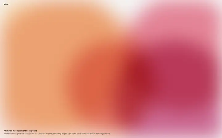
Fix: pick one accent colour that suits your product, or use a gradient that is clearly your own. Animated gradient backgrounds →
Inter or the system font at default weights, with no contrast between headline and body.
Fix: choose one typeface with character for headlines, keep body text simple, and make the size jump between them bigger. Which fonts real sites use →
When every section has the same layout and weight, nothing stands out and the page feels templated.
Fix: give each screen one main idea and one main action. Mix left aligned sections with centred ones. Hero section design →
Three cards with emoji style icons tell visitors nothing about what your app does.
Fix: show the product itself: real screens, a short looping clip or the actual interface. Features section design →
"Supercharge", "seamless", "unlock" and "the future of" are the words AI writes when it knows nothing about you.
Fix: say what the app does and who it is for, in the words your users use. One concrete example beats three adjectives.
Five different corner sizes, three kinds of shadow and spacing that changes from section to section.
Fix: use one corner size, one shadow and a spacing scale, and apply them everywhere. Ask the AI to fix all of them in one pass.
Even a clean app is forgettable if nothing about it could only belong to you.
Fix: add one signature element: a logo symbol, a live shader, a motion detail or a strong colour. Use it on every page. Free SVG logos →
AI builders design for the screen in front of you. On a phone, text gets tiny and buttons fall off the screen.
Fix: check every page at phone width and fix the layout before you add anything new. While you are there, replace the default favicon. App icon and favicon generator →
Colours, fonts, spacing and corners in one DESIGN.md file the AI reads before every change.
Swap the stock gradient, the default font and the centred everything.
Say what it does and who it is for. Cut every word that could sit on any product.
Replace icon cards with real screens or a short clip.
Then make spacing, shadows and corners consistent, and check it on a phone.
Ask Mon, the AI design assistant, share a screenshot or describe your app, and Mon tells you which defaults to replace first.
Landing pages
Build this design with AI →Hero
Build this design with AI →Landing pages
Build this design with AI →Hero
Build this design with AI →Animations
Build this design with AI →Landing pages
Build this design with AI →Every template above is an original BrowserMoon design. Paste one into Lovable, Bolt, v0, Cursor or Claude Code as a starting point, and your app starts from a real design instead of a default.
Get a licenceBecause AI builders fall back on the same defaults when you give them no design direction: purple gradients, Inter, centred layouts and three icon cards. Give the AI a design system and a reference, and the result changes.
Start with a DESIGN.md file that sets your colours, fonts, spacing and corner sizes, then paste a real design template as a reference before asking for new screens.
It makes people trust it less. Visitors now recognise the default AI look and assume the product behind it is just as rushed.
Name a style, set one accent colour and one headline font, ask for left aligned sections and real product screens, and give it a template to match.
Not to fix the basics. A design system, a good template and the nine fixes above get most apps from generic to professional. Hire a designer for a brand once you have users.
Related: App icon and favicon generator · DESIGN.md generator · Lovable design · Landing page not converting · AI design feedback · Website design ideas