User preferences picker app template
An onboarding preferences screen for iOS and Android apps. A 2-column grid of tappable category cards with active and inactive states, a progress indicator at the top, and a Continue button pinned at the bottom. Use it to personalise the app experience during first-run onboarding. Built for Bolt, Lovable, and Replit.
About this app template
Personalisation starts here. This preferences picker appears during onboarding and asks users what they are building or what they care about. Six cards sit in a two-column grid, each with a colour-coded icon, a short title, and a one-line description. Two cards are pre-selected with a blue border and a checkmark badge to show the interaction pattern. The remaining four are inactive with a light grey border. A progress indicator at the top shows where this screen sits in the onboarding sequence. The Continue button is pinned to the bottom with a white gradient fade above it so the grid content scrolls naturally beneath it. Paste it into Bolt, Lovable, or Replit and ask your AI to make the cards tappable and save the selection to your user profile.
Build a full mobile app onboarding flow with this template design
An onboarding flow is a run of screens a new user sees back to back, which makes any inconsistency between them obvious, so one onboarding screen can set the standard for every screen after it. Copy the template, paste it into Claude Code, Replit, Lovable, ChatGPT Codex, Bolt, or Cursor, and send this alongside it.
Paste into Claude Code, Replit, Lovable, Bolt, or Cursor
Common questions about this template
How do I make the preference cards tappable and save the selection?
Paste this template into Bolt, Lovable, or Replit and ask your AI to add a click handler that toggles the selected state on each card. Ask it to save the selected values to your user profile in Supabase or Firebase when the user taps Continue.
How do I use the selected preferences to personalise the app?
After saving the selections, ask your AI to filter or sort the content on the home screen based on the user's chosen categories. Pass the preference array from your database to the query that populates the home feed or recommendation engine.
Can I add more than six cards to the grid?
Yes. Duplicate any card div and update the icon, title, and description. The two-column grid expands automatically. If you add more than eight cards, the content will scroll naturally beneath the pinned Continue button.
How do I connect the progress indicator to the actual onboarding flow?
Ask your AI to build each onboarding screen as a separate step and pass the current step index as a prop to the progress indicator component. Each dot fills in blue as the user advances through the flow.
Use this template for
- ·Onboarding preference and interest selection screens for iOS and Android
- ·Personalisation steps in first-run app onboarding flows
- ·Category or goal selection screens before the main experience
- ·Multi-select preference pickers for recommendation engines
More onboarding app templates
View allNews app onboarding screen
News app onboarding screen
Onboarding
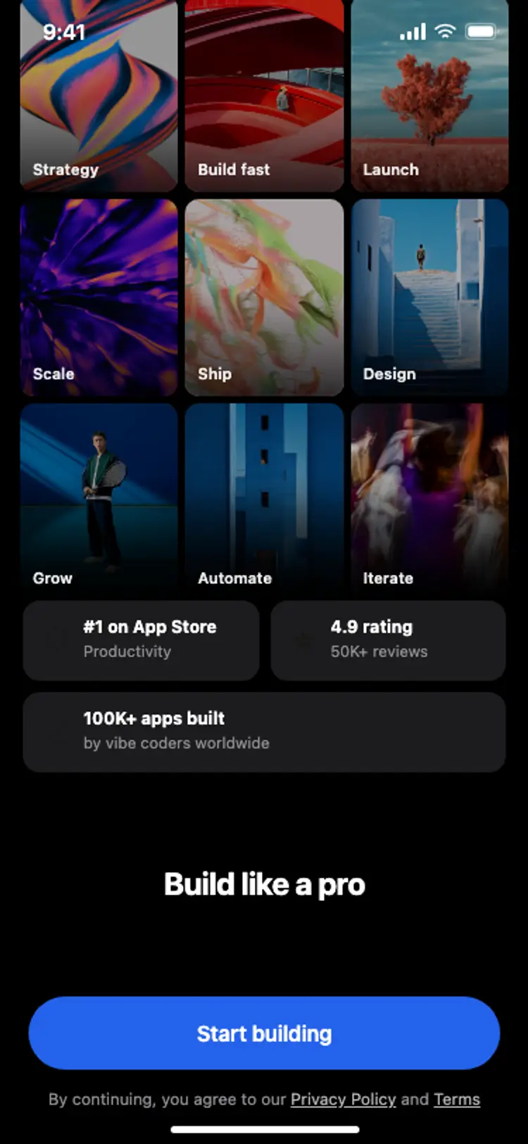
Onboarding with social proof
Onboarding with social proof
Onboarding
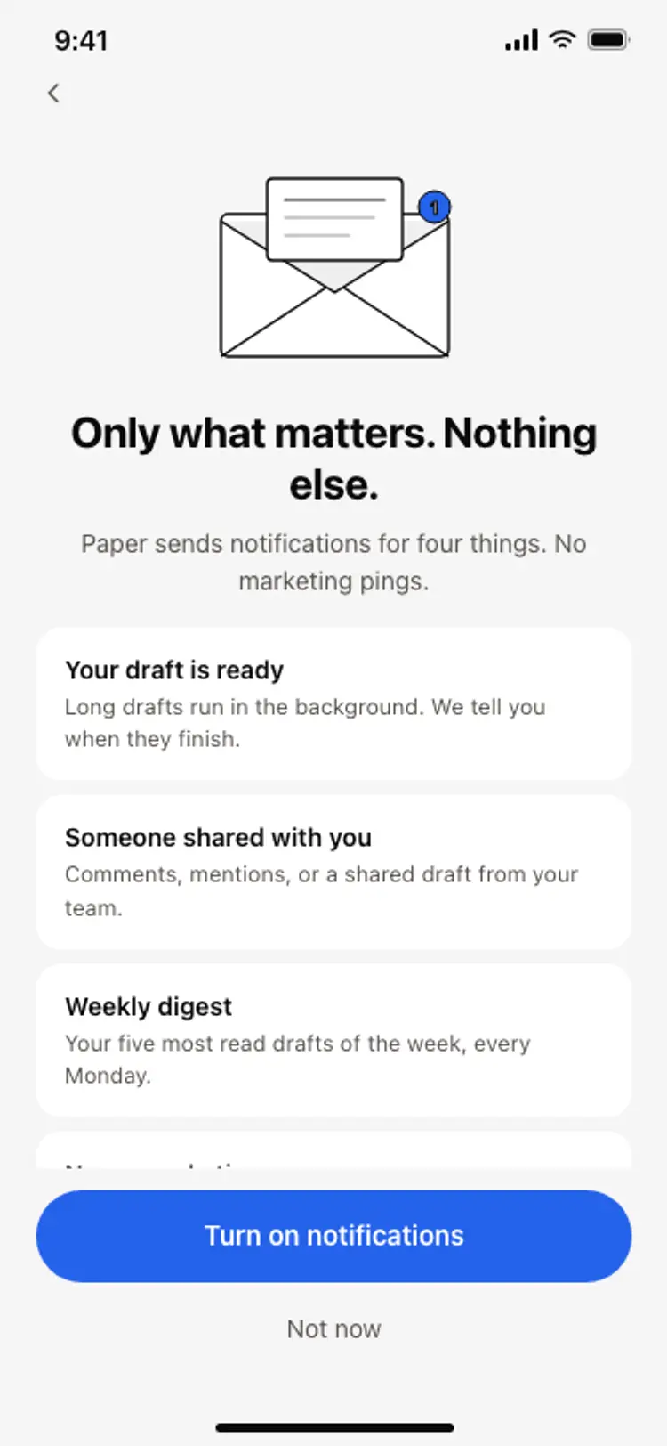
Notification preferences screen
Notification preferences screen
Onboarding
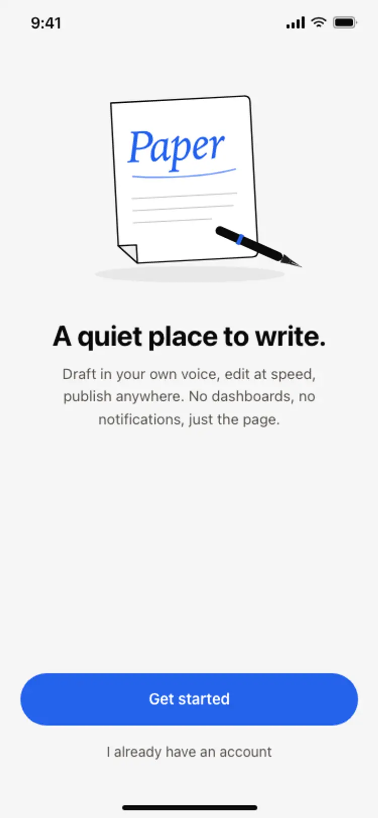
App onboarding welcome screen
App onboarding welcome screen
Onboarding
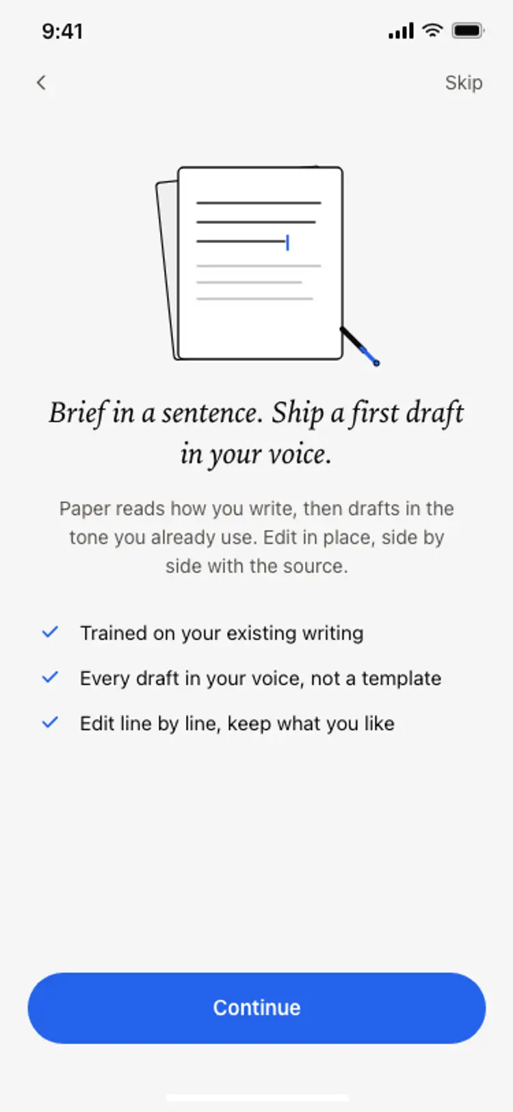
Onboarding benefits screen
Onboarding benefits screen
Onboarding
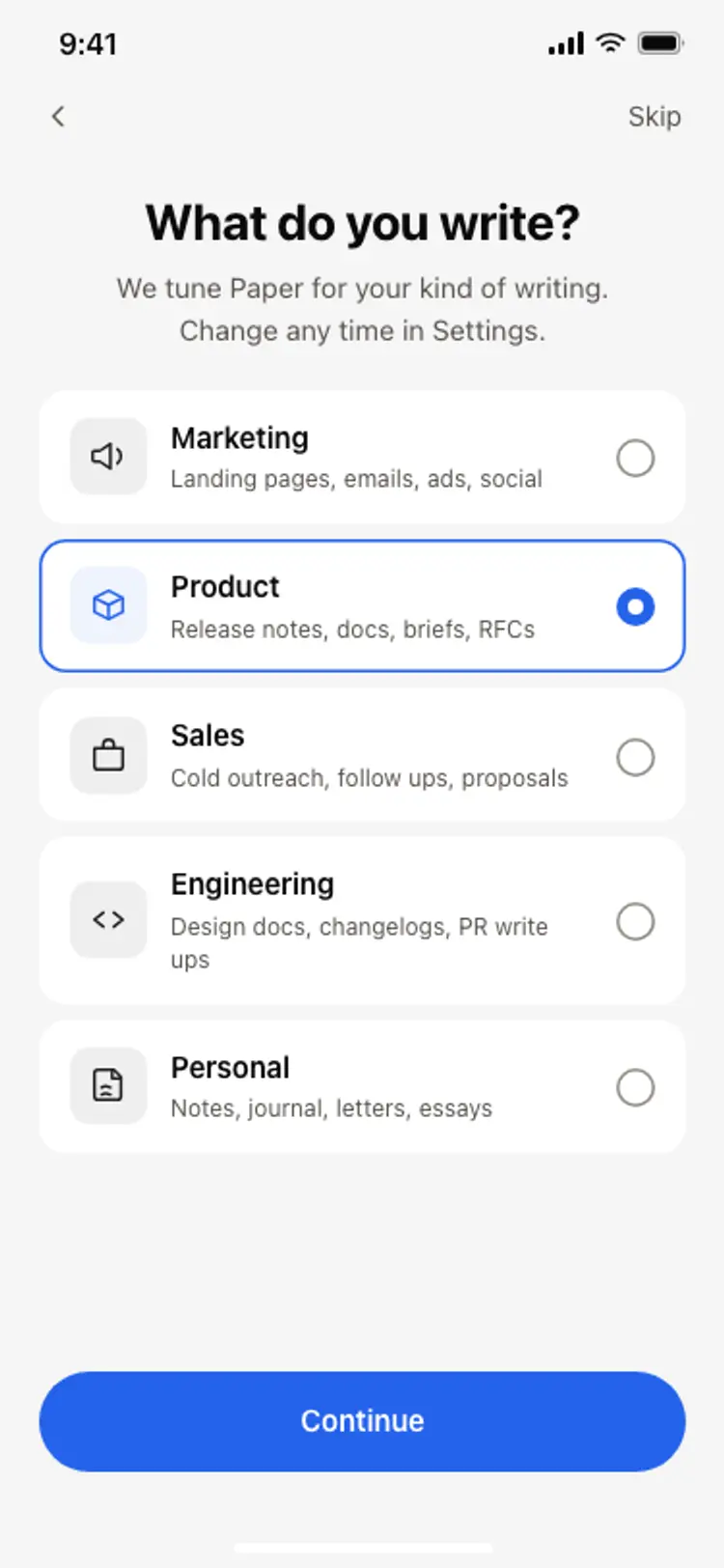
Onboarding role picker
Onboarding role picker
Onboarding
Other app templates you might like
See also
Browse app templates