Lovable card templates for AI websites and apps
Real card designs you can copy into Lovable. Lovable turns a pasted template into a React app styled with Tailwind CSS and shadcn/ui components. Below: the designs, how to set Lovable up so it keeps the design, and what makes a good card section.
Lovable card templates
85 card design templates for Lovable. Browse the full BrowserMoon library for every template category.
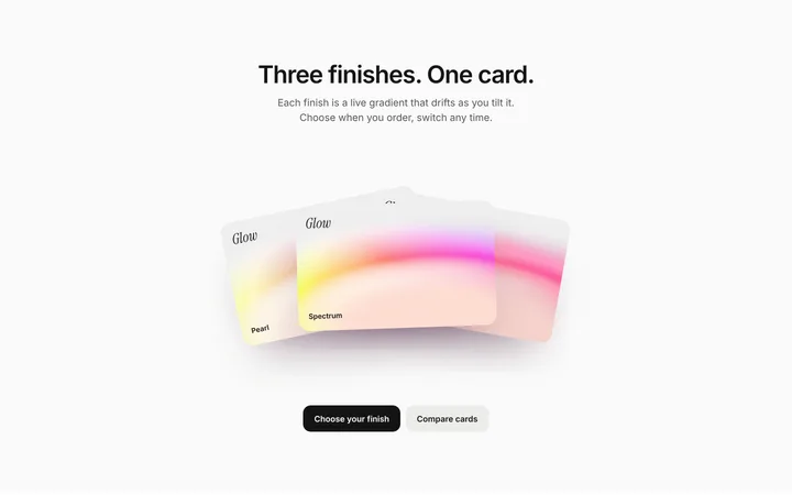
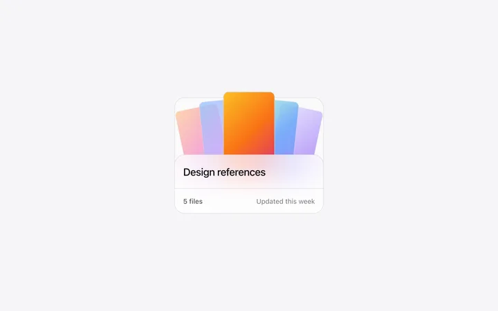
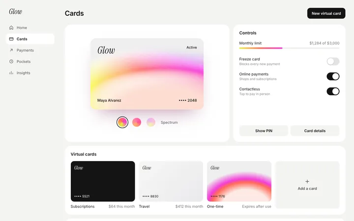
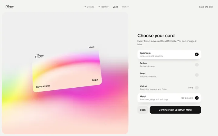
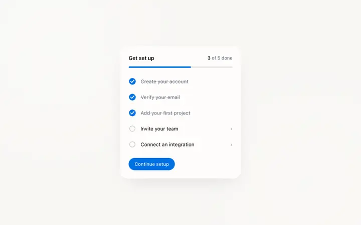
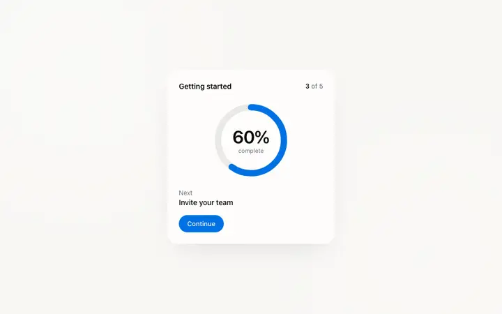
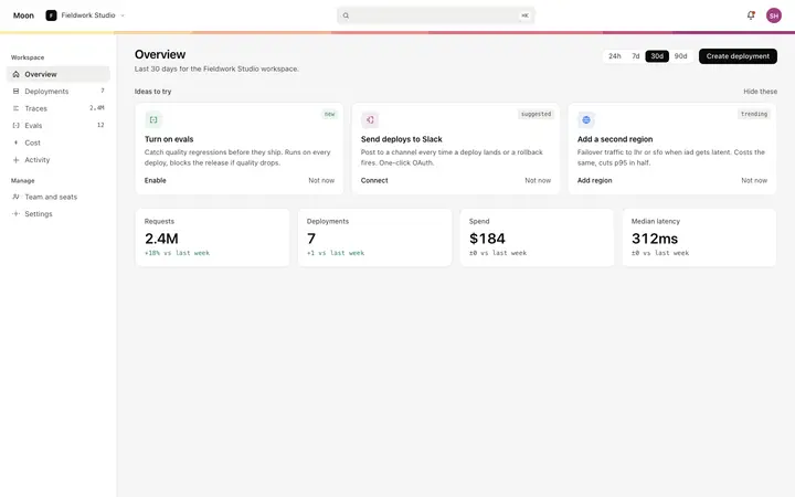
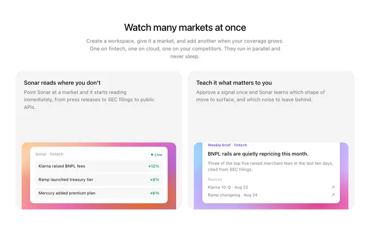
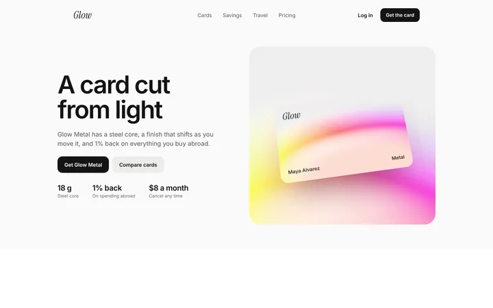
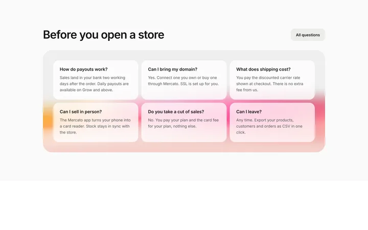
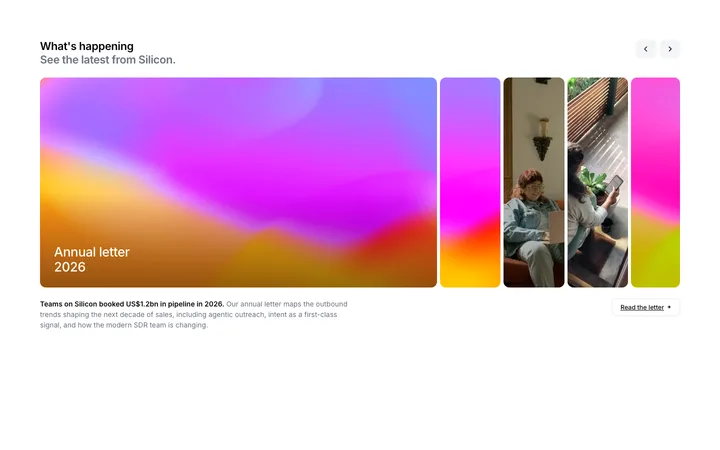
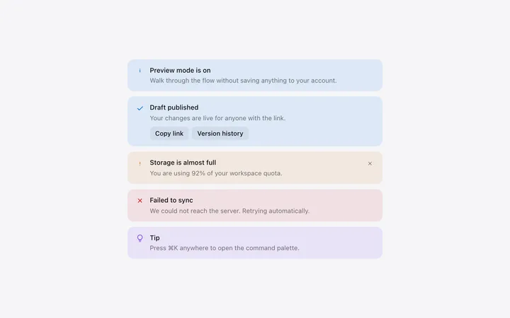
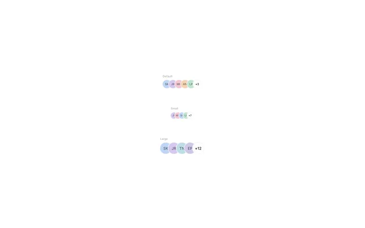
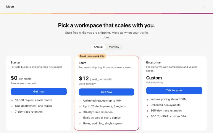
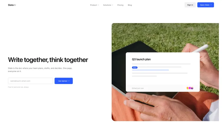
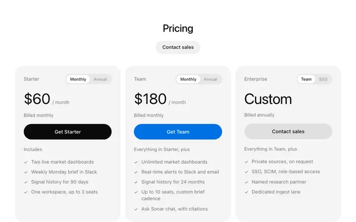
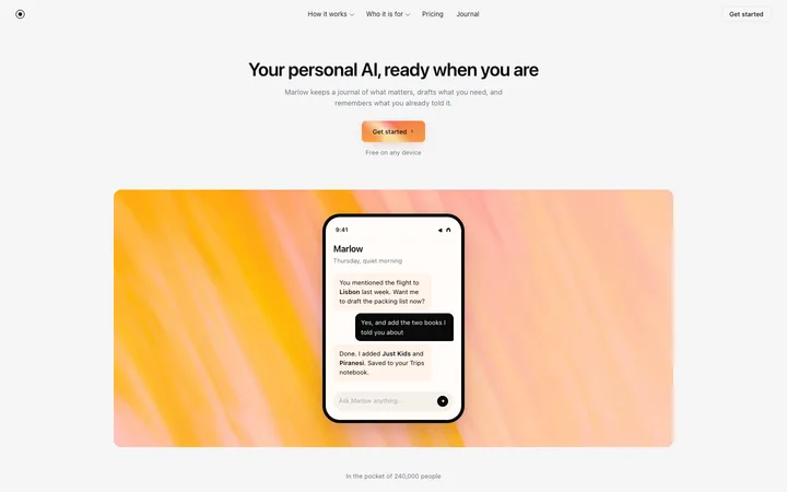
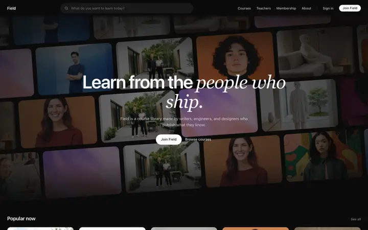
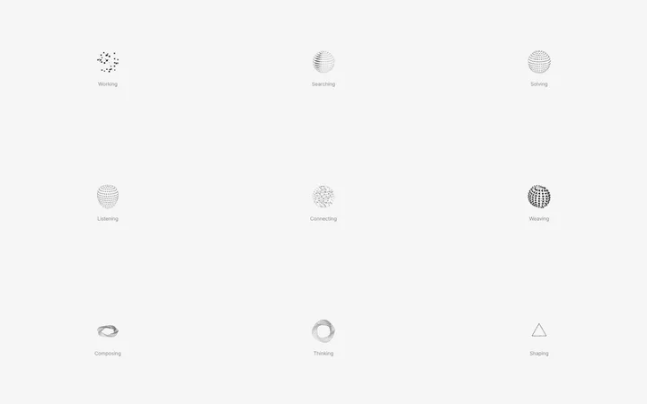
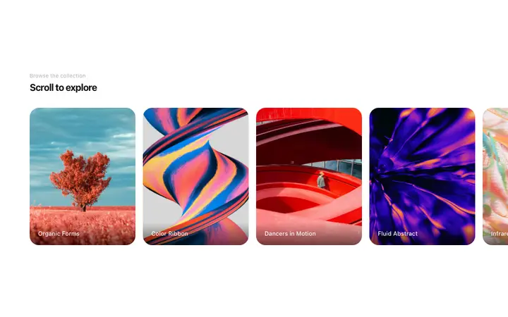
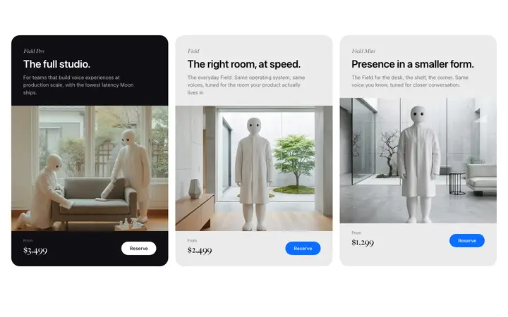
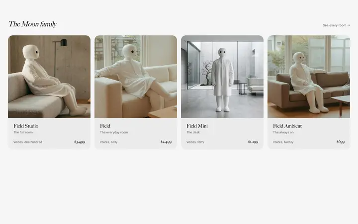
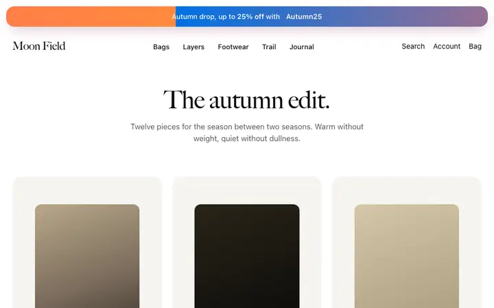
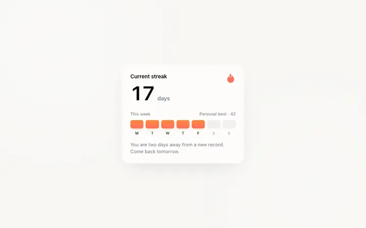
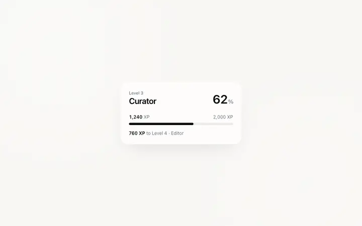
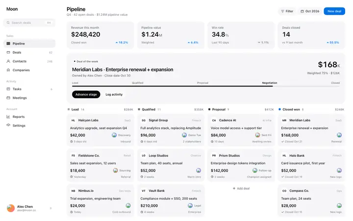
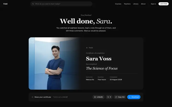
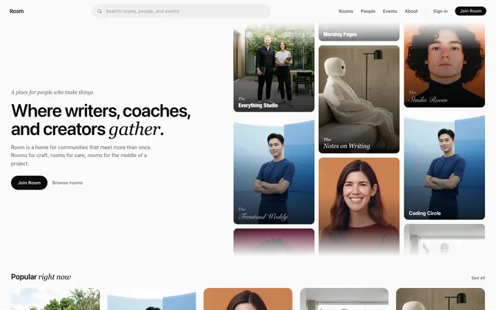
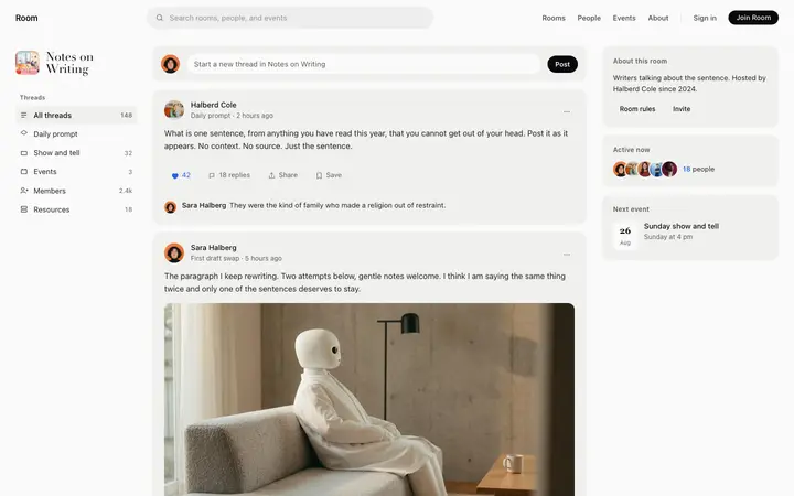
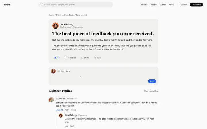
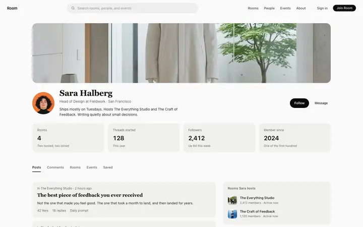
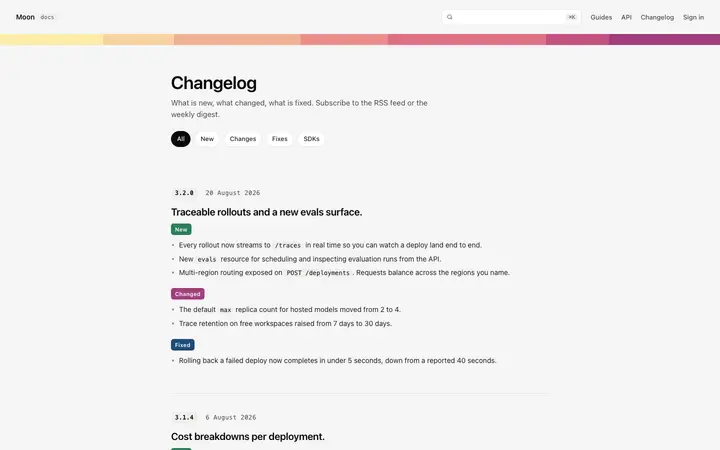
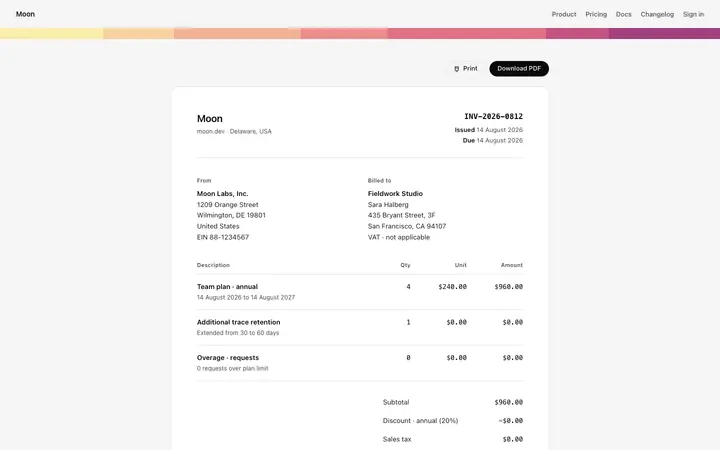
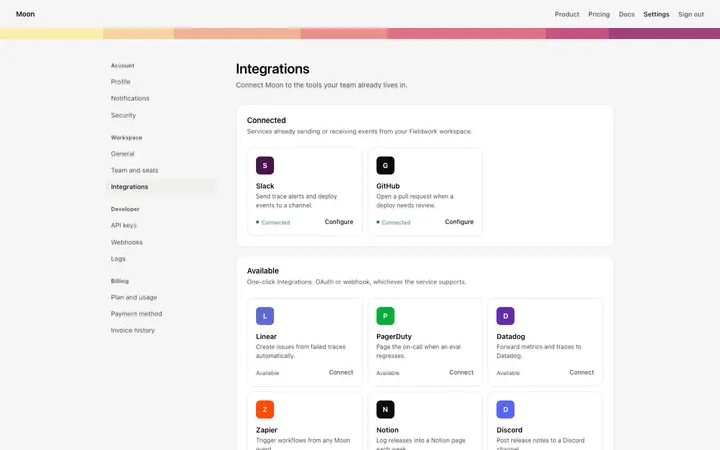
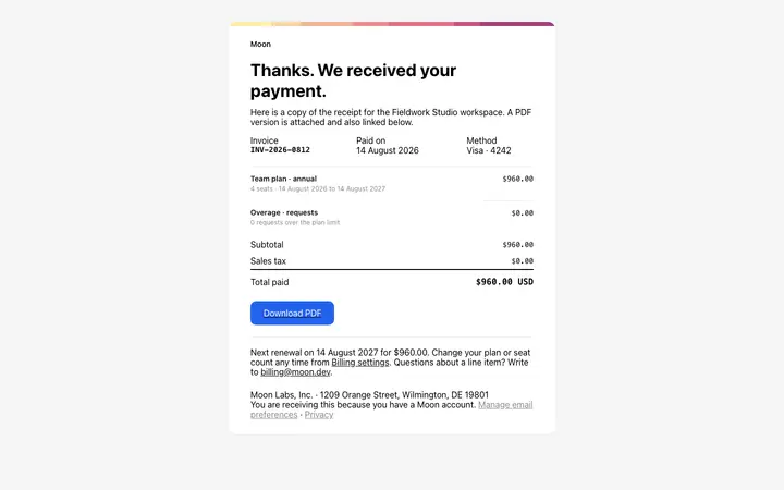
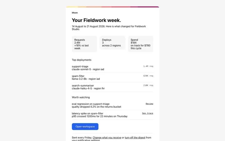
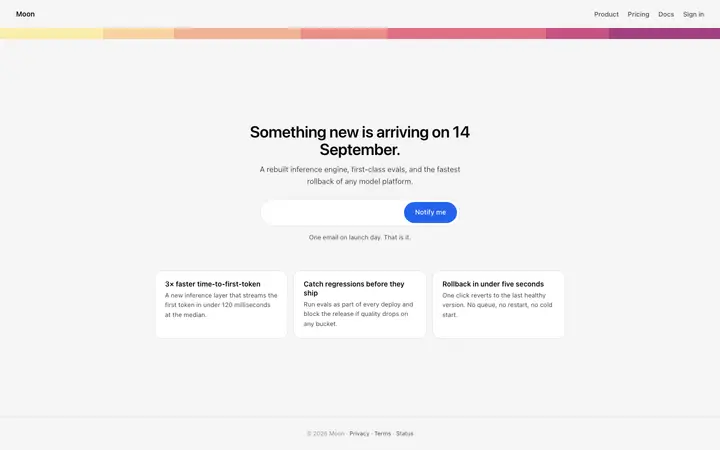
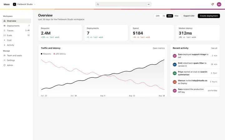
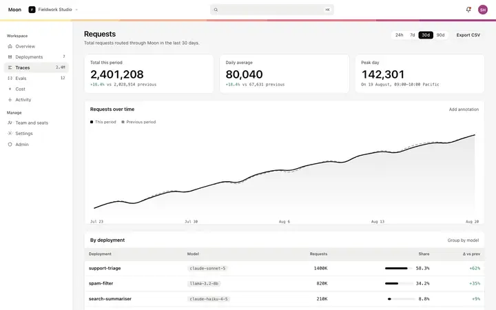
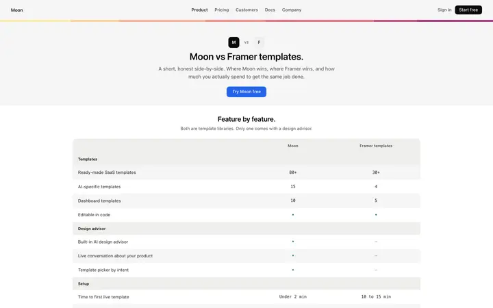
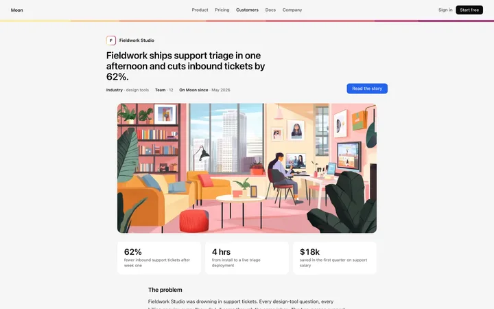
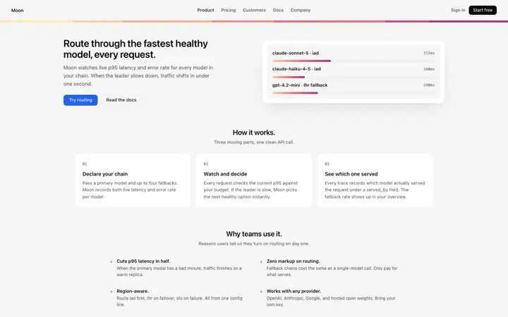
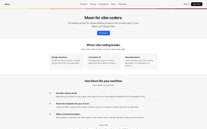
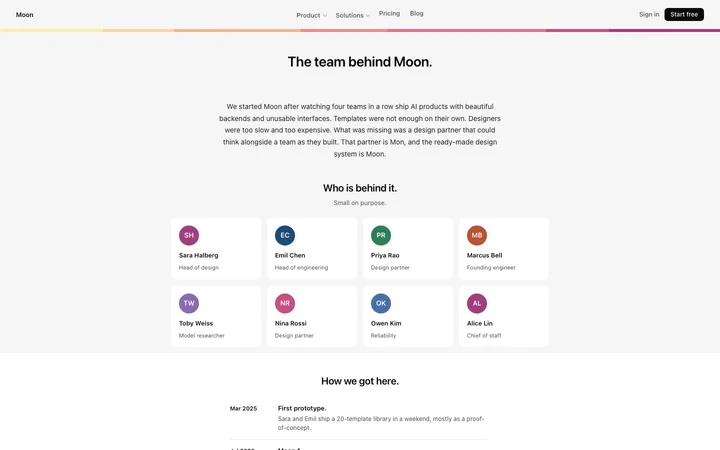
48 of 85
How to use card templates with Lovable
Pick a design
Choose a card design above and open it to see it live.
Copy the template
Copy the template from its page. It is one HTML file with no dependencies.
Set up Lovable
Paste the template into your first prompt and add your design rules to the project's knowledge, so every later prompt keeps the same look.
Prompt, then refine
Paste it and describe your product. Then follow up with: "Keep the exact spacing, font sizes and colours from the template I pasted. Only change the copy and the links."
What makes a good card section
Common types: feature cards, pricing cards, product cards, profile cards and stacked or tilted card showcases.
One idea per card
A title, a short line and one action at most.
Consistent size
Cards in a row share height and spacing.
Whole card clickable
When a card leads somewhere, the full card is the link.
Common mistake: Cards stuffed with buttons, tags and long text.
Keeping the design in Lovable
Lovable builds a working app from a chat, so it suits founders and designers who want a product online quickly without setting up code.
What Lovable builds
A React app styled with Tailwind CSS and shadcn/ui components.
Where the design goes
Paste the template into your first prompt and add your design rules to the project's knowledge, so every later prompt keeps the same look.
Lovable and card sections
Lovable rebuilds the design with its own components, so spacing and fonts can shift toward its defaults. Paste the template again with your follow-up prompt if it starts to drift.
What to tell it
Keep the card size, radius and spacing consistent, and keep one action per card.
Not sure which card design fits?
Ask Mon, the AI design assistant, describe your product and Mon suggests the card design and how to prompt Lovable with it.
Frequently asked questions
How do I use a card template in Lovable?
Paste the template code into your Lovable prompt as the visual baseline for your app. Paste the template into your first prompt and add your design rules to the project's knowledge, so every later prompt keeps the same look.
What does Lovable turn the template into?
A React app styled with Tailwind CSS and shadcn/ui components.
How do I stop Lovable changing the design?
Lovable rebuilds the design with its own components, so spacing and fonts can shift toward its defaults. A follow-up prompt that helps: "Keep the exact spacing, font sizes and colours from the template I pasted. Only change the copy and the links."
What makes a good card section?
One idea per card: a title, a short line and one action at most. Consistent size: cards in a row share height and spacing. Whole card clickable: when a card leads somewhere, the full card is the link.
Any Lovable tips for card sections?
Lovable rebuilds the design with its own components, so spacing and fonts can shift toward its defaults. Paste the template again with your follow-up prompt if it starts to drift.
More Lovable template categories
Card templates for other tools